
Web design inspiration, resources and tutorials.
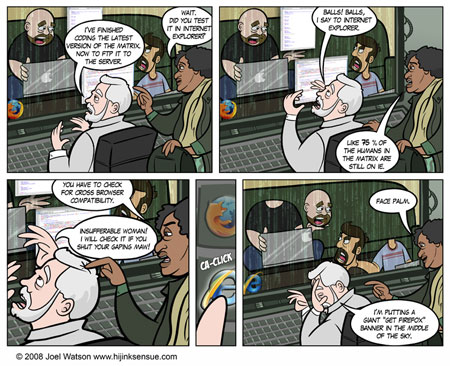
When confronted to irrational situations, we naturally tend to get lost and lean toward irrational solutions. Debugging Internet Explorer often makes you feel lost, thus pushing you to explore unknown CSS techniques and beyond. I am sharing these techniques with you, but please only use them if you are desperate as they only work once […]
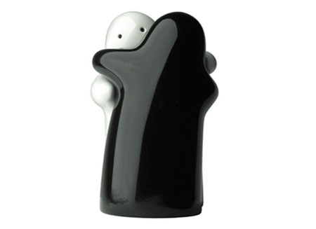
Yes, I have to admit it even though I don’t like them: puppies are cute. This said, some designers find a way to make their work even cuter than some furballs, see it for yourself. Hugging Salt & Pepper, will you ever be cruel enough to separate them? Head chefs, cute as hell, not so […]

With the past years rise of web 2.0, javascript frameworks have developed and made it easy for the average webmaster to make his site more dynamic. One of those frameworks, jQuery, has become extremely popular due to its ease of use and its incredibly light weight. Following are ten jQuery scripts to improve your site’s […]

The web is full of resources, but they’re often hard to reach. This is the reason why I think it’s important to organize them with a coherent structure and share it with you. So just bookmark this page for whenever you’ll need it, it’ll be useful. Please also mention if I missed anything. Organizing Sample […]

Starting in september, Adobe will be launchine a mobile photo sharing site named “Phoshop online”. This is no big news for the graphic design industry, but it might be interesting for people using their mobile phone to take pictures. Basically, the features will be: Upload pictures from anywhere (with internet access of course) Access from […]

Unfortunately, I have to say, Jakob has perhaps the worst site design I have ever seen. It is as if, while he is handing out the Oscars, he is wearing a plaid polyester suit. In truth his site is fine from an information architecture perspective. But from an aesthetics perspective it is awful. And aesthetics […]
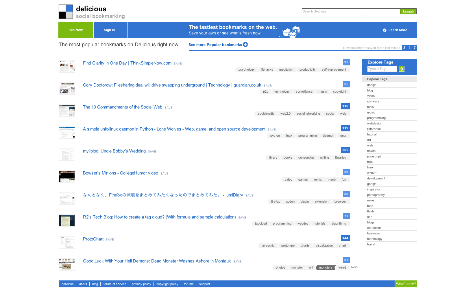
It may sound a little pretentious to share this screenshot of a redesign of the new Delicious design, but as a big user of the bookmarking service I really feel like they have not gone all the way. I actually didn’t do much but try to declutter the interface of the homepage and add a […]
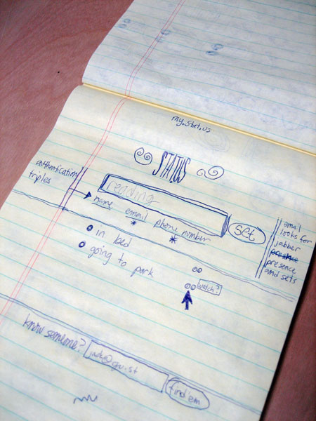
Probably improving the usability of your website more than its actual design, paper prototyping is a very important step in internet creation processes. The Deeplinking blog wrote a great post showcasing some of the web’s big sites prototypes, such as Twitter’s sketches that you can see in the image above. When I was in design […]

A nice post on the Official Gmail Blog just proves once again that designing a single functionality for a popular web application isn’t as simple as it looks. The process they went through is intersting, and I must say that I truly hope that the Hotmail team did read it.

After my graphic design school I quickly started to gain interest in webdesign, I also quickly started to get frustrated by the limitations of web typography. The first thing I did was head to flash to be able to use any font I wanted, until I did understand why it wasn’t a good idea to […]
When you are a large multinational company like Google, the slightest changes in your identity will quickly be noticed. A few week ago, the big capital “G” that was used as a favicon on every google site turned into an ugly lower-case “g”. That tiny event gave birth to tons of reactions on blogs or […]

Plumbing art Hairstyles your mother wouldn’t approve History moments in Lego Speakers designed the way they should be Whiskas origami advertisement Helvetica Poster Beginner jQuery tutorials Help yourself Helvetica calendar 2008 Video games ruined my life Giant letters furniture Typographic packaging The anatomy of a gummy bear If you don’t want to miss any of […]
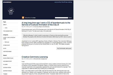
Happy Cyclope is a 2 columns, easy-to-customize wordpress theme. It is of course widget ready and WordPress 2.5 ready, but hasn’t been tested with previous versions. Categories and archives pages are presented as lists, which makes it nice for sites with a lot of content. The header is made of two images, one for the […]

The baby giraffe is here Daily drawings from the New York Times crosswords SEO guide for designers Zebra striping, does it really help? Brilliant ad for knives The most dangerous species in the mediterranean You can of course follow me on my Tumblelog if you are a Tumblr user.

If you are reading blogs, there are good chances that you already know about RSS. Anyway, DailyBlogTips organized a RSS awareness day to help the expanding of this technology’s usage. I will not explain what RSS is here, so if you don’t know anything about it, just go there. So what can designers do with […]