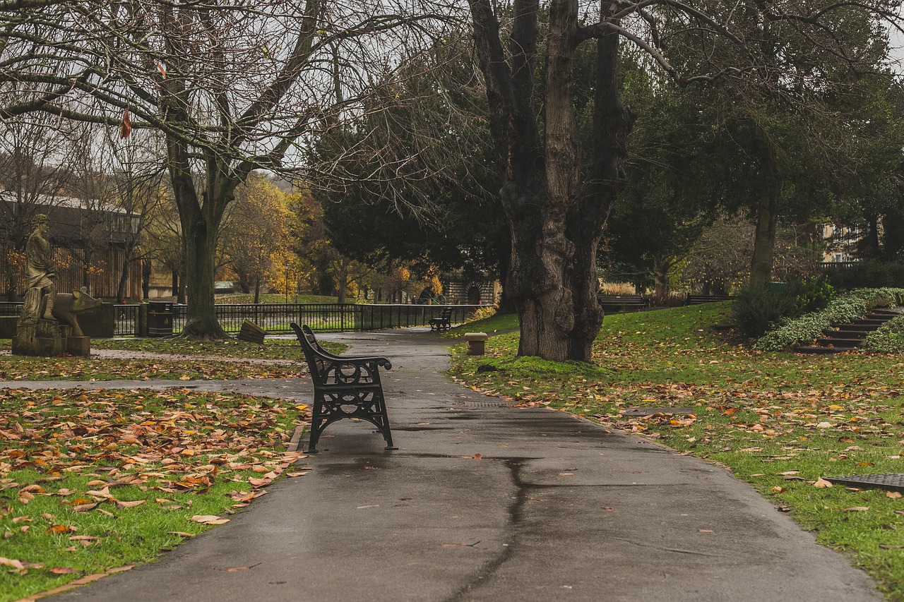
The fact that landscaping and graphic design are both types of design should already indicate that there are certain things the two have in common. Indeed, you can learn a lot about graphic design just by studying the routine of a successful landscaper. Here is a look at some of the most important principles of design that these two professions have in common.
1. Balance Is Best
Neave Group Outdoor Landscape Solutions says that great landscape design emphasizes balance. Determining each item’s size and position must be done in the context of maintaining a sense of appropriate order and proportion for the space. Just like a canvas, each of the pieces of landscaping must be placed in the right spot. Imbalance can lead to a feeling of congestion, excessive space or disproportion.
This is no different than graphic design, where the designer has to tweak projects in Illustrator or Photoshop until it feels perfect – meaning, it balances well with the other elements. There is no one single correct way to get balance, so it is often about trying out different arrangements until you get it right.
2. Color Is King
When you are shopping for outdoor furniture, you will have to evaluate the different furniture styles to find the right one. Besides that, it’s also important to choose the right color. The right choice of color is crucial if you are going to realize an effective blend of hues within a certain area. If you do not get the color right, the space could feel disorderly, chaotic and unwelcoming.
This is the same problem a designer faces with poor color choice in graphic design. Again, choosing the right elements of a project is the first thing you must do. Next, they must be arranged appropriately, before you eventually choose the best colors. There must be an overarching color scheme that brings the different elements of the project together.
3. Maintain the Motif
When you start picking the plants and outdoor furniture for your home, chances are you will be drawn to a particular style. It may be easy to stick with this motif in the beginning when you are still excited about it, and cannot wait to see how it will turn out. As time goes by, however, you may begin to get distracted by new trends and be tempted to switch to a different theme. Slowly, your theme begins to break down and you gradually edge towards design chaos.
Similarly, when you start on a graphic design project, you have to identify a strong motif from the get-go that you can run with to the end. When choosing a motif, be specific. Do not settle for general descriptions such as “vintage,” “retro” or “modern.” Rather, think about what inspires you about the design and what sources you intend to draw further inspiration from. Even if you later pick elements that are not strictly within this theme, make sure that they complement it appropriately.
4. Feel the Fun
Setting up the elements of a front or back yard can be exhausting work, especially if you end up changing your plan several times. If you do not enjoy the job, it won’t be long until you feel frustrated and overwhelmed. You should get a sense of satisfaction from watching it all gradually come together.
Similarly, the most successful graphic designers are those who enjoy the job – whether it’s creating a logo or setting up page layout. There will always be difficult days, but it is all about adopting the right mindset from the beginning.
There’s More
Landscaping and graphic design have a lot more in common than you might first imagine. The same core principles that improve the chances of a landscaper’s success are often the same for a graphic designer.

