In the age of information, it is paradoxically harder to get your message across, as the advertising “targets” are totally overwhelmed by images thrown at them everywhere: smartphones, billboards, TV, radio,… The world has become a constant stream of information, carefully mixing genuine information with advertising.
With that context in mind, it becomes crucial to be creative and impactful in your advertising campaigns. In fact, the focus should be put on the visual aspects of your advertisements in order to attract the viewers attention, or they will never get a chance to read your amazing copy. In this post, we present some advertising visual examples for your inspiration.
1. McDonalds, the real milkshake
The first role of the visual in this advertisement is to get the attention of the viewer. This cow on a trampoline is too unusual and absurd not to look at. Once the customer reads the slogan, it’s up to his imagination to figure out how the milkshake is made.

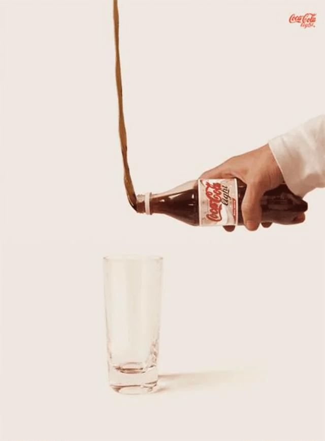
2. Coca Cola Light
The power of the visual in this advertising for Coca Cola Light is so powerful that it doesn’t need any copywriting. The brand is instantly recognizable by anyone, so all the advertiser needed to do was to express the idea visually, which he did in a brilliant manner by exaggerating ten fold the properties of the product.
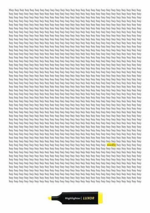
3. Luxor Highlighters
With highlighters, it’s not too difficult to explain what they do, but it’s better to explain it in a visual way. In this case, using a popular saying, the point is made instantly and in a humourous way. This is a total win as far as we are displaying visual advertising examples.
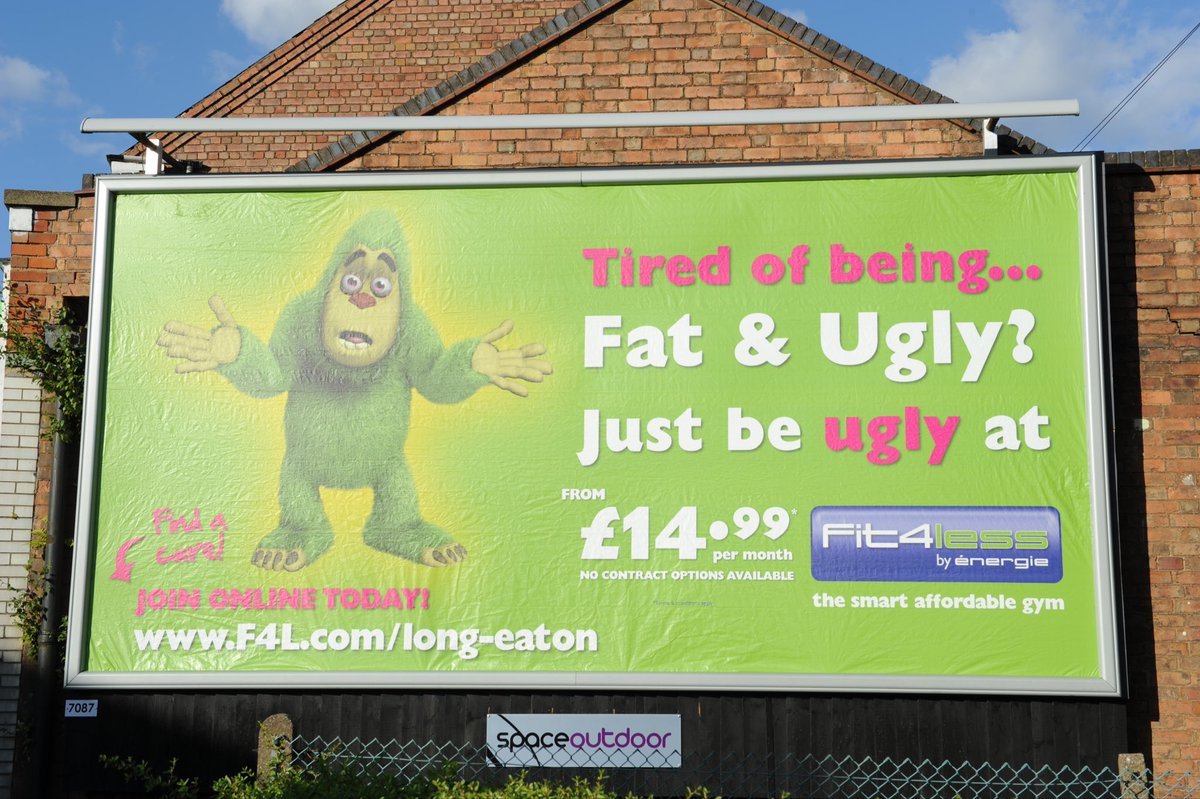
4. Fit4Less
This advertisement is a real nightmare for any graphic designer: poor contrast, ugly illustration, bad layout, bad colors, and an awful logo. However, it’s very efficient for one reason: provocation! By insulting the reader, it brings the solution and the features of the service offered by the fitness.
5. Plum Guide
Visual advertising doesn’t mean that you have to use illustrations or photos to attract attention. A bright color and text that’s quick to read suffice in many cases. This advertising for Plum Guide is selling the FOMO to force you to take action, reminding you how short life is.

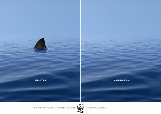
6. World Wildlife Foundation
For this advertisement, the WWF opted for visual minimalism with a strong impact. It plays on the (mostly irrational) fear of sharks and quickly shifts the whole perspective to remind us of the real, broader danger that we face with wildlife extinction. Just removing a simple shark fin is incredibly powerful in this example.
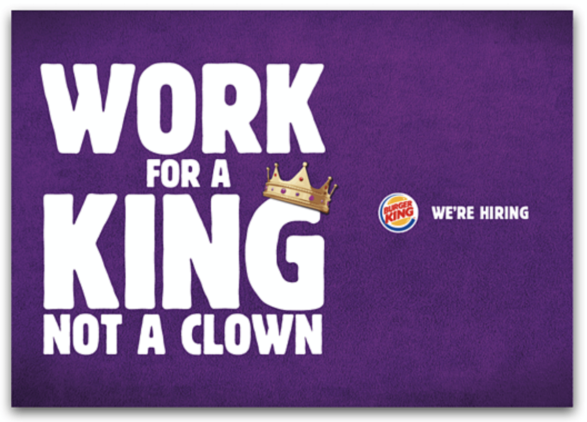
7. Burger King
When you are recruiting, it can be useful to target your competitor’s employees, as they are already familiar with the field. In this case, Burger King is sending a low blow to McDonald’s, but in a subtle enough way to stay within the law.
8. Weight Watchers
Remember the old adage: “A picture is worth a thousand words”? This visual advertising for WeightWatchers is the perfect example of it. The “Entrance” and “Exit” signage might be a bit too small, but the large and small doors are impactful enough to make a strong impression on the potential customer.

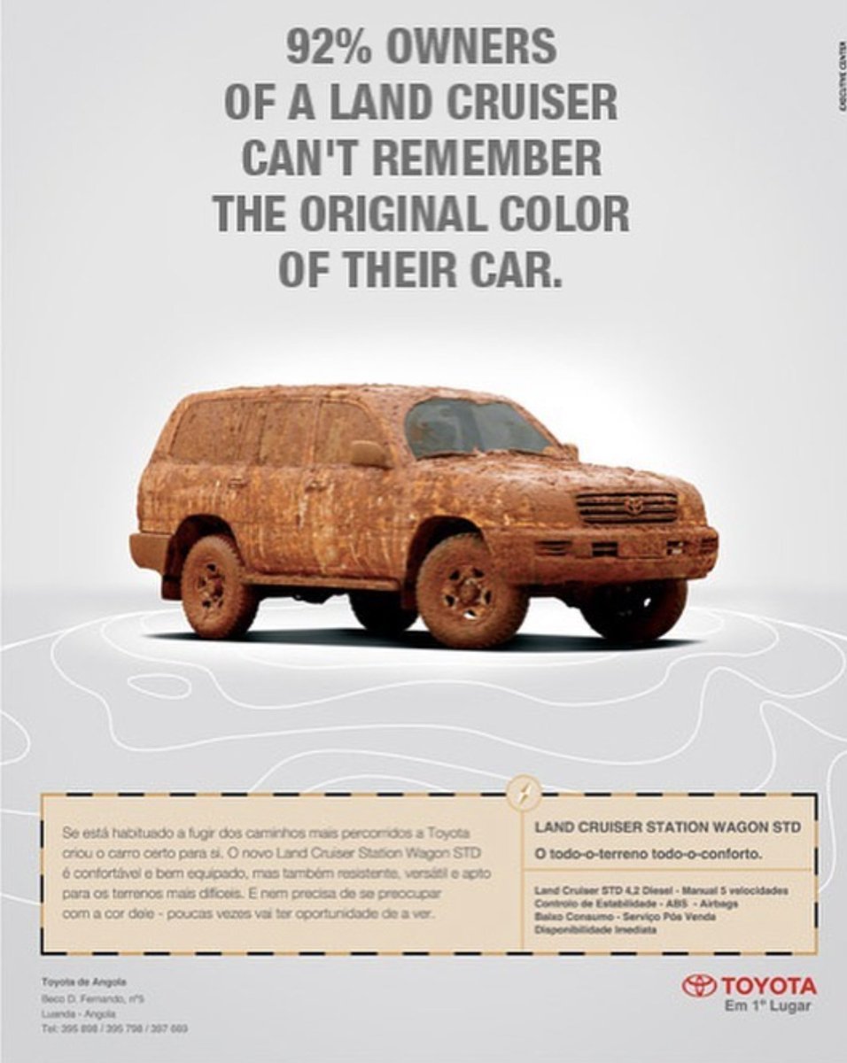
9. Toyota Land Cruiser
Land cruisers can go pretty much anywhere, which is an important feature for the car. So important, in fact, that the brand went as far as hiding the design of the car in order to highlight the capacity of the car. On top of that, a made-up statistic is perfect to illustrate the life of a land cruiser owner.
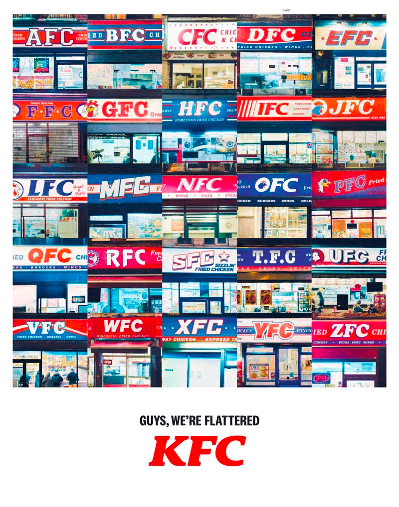
10. KFC
Imitation is a form of flattery. KFC perfectly knows it and went as far as including all the copycats in its advertising to show how often they are copied.
