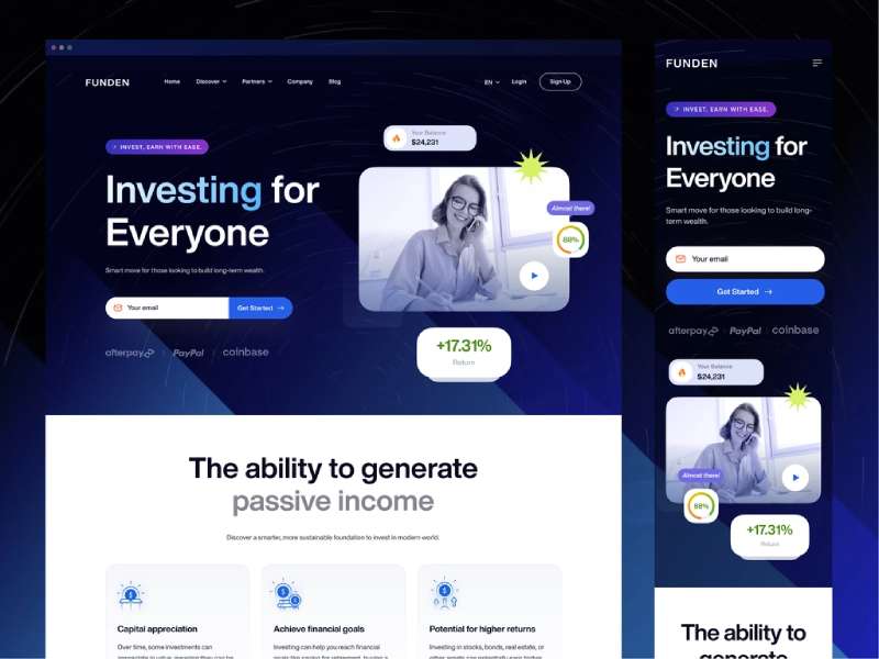
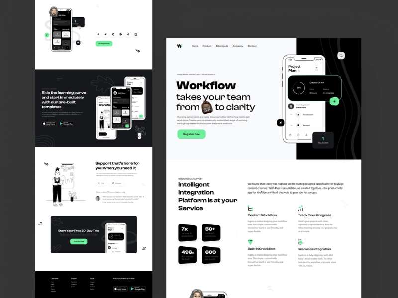
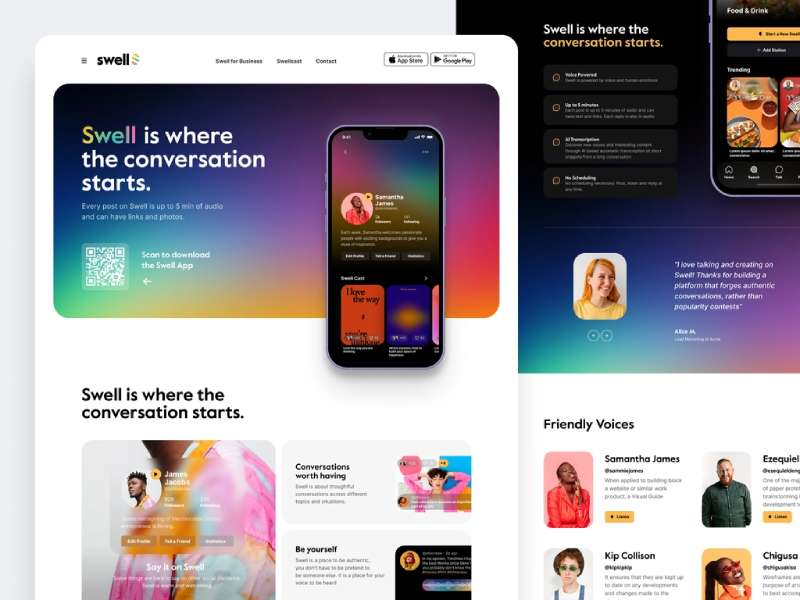
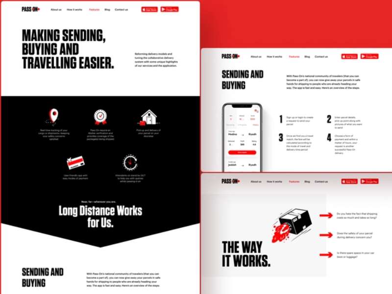
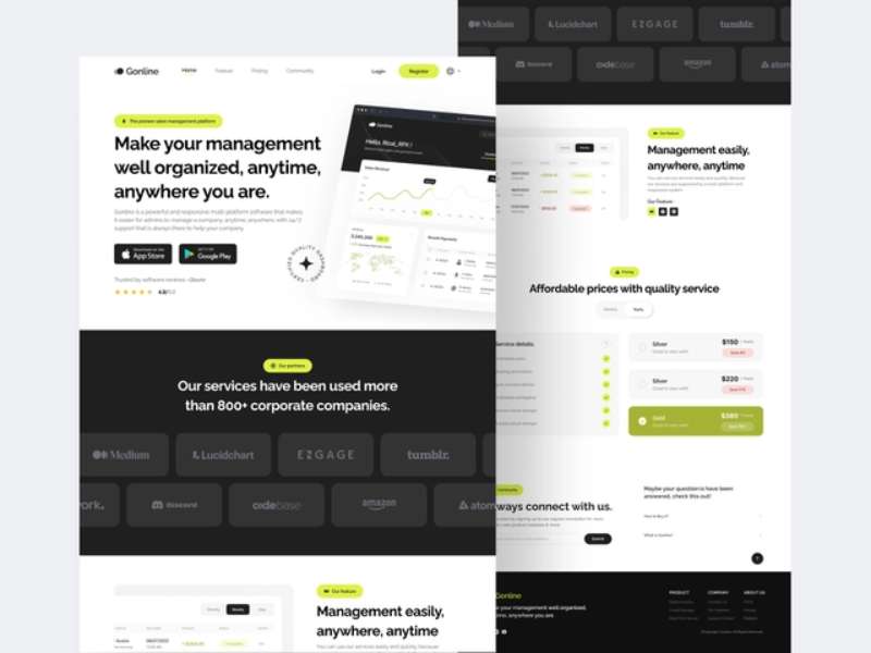
If you’re like me, an app enthusiast, you’ll understand the thrill of finding a great app that solves a problem or makes life easier.
But think about it; what usually convinces you to download an app? More often than not, it’s the app’s landing page.
Landing pages, particularly app landing pages, are crucial in the digital product ecosystem, acting as the bridge between user curiosity and app installation.
What is an App Landing Page?
Let’s first clarify what an app landing page is. Imagine this: you’re scrolling through your social media feed and see an intriguing ad for an app.
You click on the ad, and voila, you’re redirected to a webpage dedicated entirely to that app. This webpage is the app’s landing page. It’s distinct from other pages because it has a singular focus — to introduce the app and convince visitors to download it.
The Purpose of App Landing Pages
So, why do we need an app landing page? Well, there are three significant reasons.
Firstly, they’re instrumental in conversion rate optimization. An effective landing page helps convert mere visitors into active app users. It does this by convincing them of the app’s value proposition, thus pushing them towards downloading and using it.
Secondly, app landing pages provide specific product information. They showcase the app’s features, functionality, and benefits, giving potential users a clear understanding of what the app does and why it’s useful.
Lastly, and perhaps most importantly, app landing pages drive user engagement and app downloads. Through clever design and persuasive copy, they guide visitors towards the desired action — downloading the app.
Key Elements of Effective App Landing Pages
Alright, let’s get down to the nitty-gritty. There are four key elements you need to include in your app landing page to make it effective.
Start with your app icon and headline. This is typically the first thing visitors see, so make it count. Your app icon should be distinctive and related to your app’s function, while the headline should succinctly convey your app’s main benefit.
Next is the description. Keep it clear and concise. Remember, the aim is not to overwhelm but to inform and convince. Focus on your app’s unique features and how they benefit users.
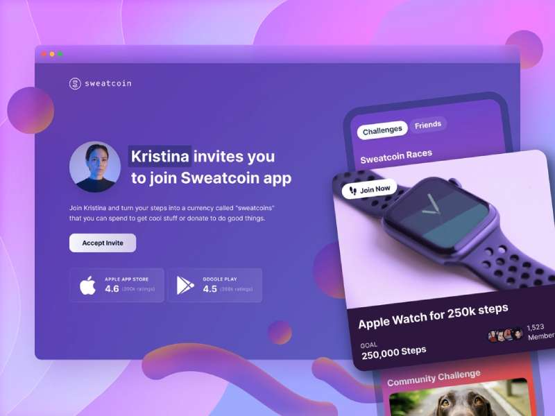
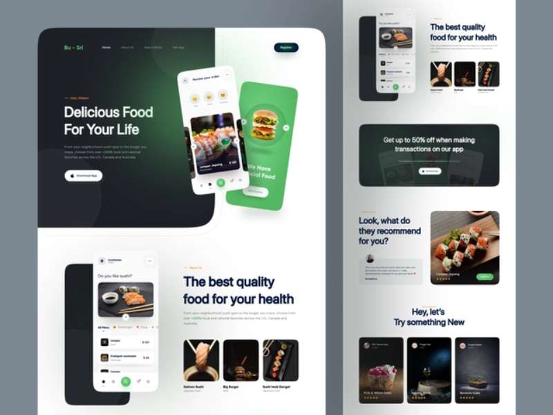
Moving on, you need to have a visual representation of your app. This can be in the form of screenshots, videos, or even a demo of your app in action. Visuals not only add aesthetic appeal to your landing page, but they also allow potential users to get a feel of your app’s user interface and functionality.
Lastly, you can’t forget the call-to-action (CTA). This is essentially the ‘download’ button. Your CTA should stand out and be compelling enough to spur visitors into action.
Design Principles for App Landing Pages
Designing an app landing page requires a fine balance between aesthetics and usability. Let’s break this down.
When we talk about aesthetics, we’re looking at things like color, typography, and layout. You’ll want to choose a color scheme that aligns with your brand identity and grabs attention. Typography plays a crucial role too, as it influences readability and overall visual impact. The layout of your landing page should be clean and intuitive, guiding the user’s eye from one element to the next in a logical manner.
Next up is usability. Navigation should be seamless, with all elements easily accessible. This includes things like buttons, links, and forms. Your landing page also needs to be responsive, which means it should display correctly on various screen sizes and devices.
Finally, consistency is key. This refers to consistency in branding, messaging, and theme. Your landing page is an extension of your brand and should reflect this in its look and feel. The messaging should be uniform across all elements, and the overall theme should align with what your app represents.
When you’re stuck in a design rut or just need some inspiration, you can always explore a variety of excellent app landing page templates. It’s a great way to get the creative juices flowing again.
Crafting a Compelling App Description
Alright, let’s dive into one of the main ingredients of our app landing page cocktail – the app description. So, you’ve got a super cool app, but how do you communicate its awesomeness to your potential users? Let’s break it down.
Showcasing Benefits, Not Just Features
Here’s the deal: people don’t just want to know what your app does. They want to know how it’ll make their lives better. So, talk about the benefits. For instance, don’t just say your app helps users track their meals. Instead, say something like, “Our app helps you effortlessly track your meals, making it easier for you to maintain a healthy diet.”
Highlighting Key Features
Now, this doesn’t mean you should completely ignore your app’s features. Far from it! Features make your app unique, so they definitely deserve some spotlight. Just remember to frame them in a way that highlights their benefits.
Using Persuasive and Engaging Language
And, of course, make sure your description is engaging. Use language that speaks to your target audience and compels them to take action. Be enthusiastic, be persuasive, and most importantly, be authentic.
Visual Components: Screenshots and Videos
Next up on our list are screenshots and videos. I can’t stress enough how important these are. Why? Well, they provide a visual demonstration of your app in action, which can significantly boost its appeal.
Creating Compelling Screenshots
Your screenshots should clearly show what your app looks like and how it operates. Make sure they’re high-quality, visually appealing, and representative of your app’s most compelling features.
Utilizing App Preview Videos Effectively
App preview videos can also be a powerful tool. They offer a dynamic look at your app, allowing potential users to visualize the experience of using it. Keep your videos short, engaging, and informative.
The Role of User Reviews and Testimonials
Now, let’s talk about something that many app developers overlook – user reviews and testimonials. These can serve as a powerful form of social proof, convincing potential users that your app is worth downloading.
The Influence of Social Proof on Decision-Making
People are more likely to try something new if they see others have had a positive experience with it. So, don’t be shy about showcasing positive reviews and testimonials on your landing page.
Incorporating Reviews and Testimonials Effectively
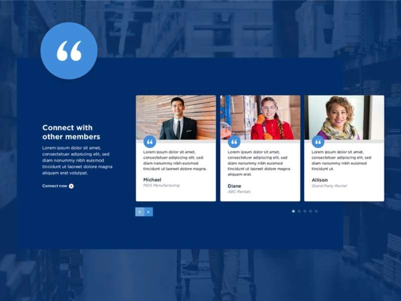
You can incorporate reviews in various ways. You might display a few highlighted reviews or have a carousel that shows a series of testimonials. Just ensure they’re visible and easily readable.
Importance of a Strong Call-to-Action
We’re at the last point of this part of our journey, folks – the call-to-action or CTA. This is where the magic happens. It’s where visitors become users.
What Makes a Good CTA?
A good CTA is clear, compelling, and easy to spot. It should communicate exactly it – that’s a surefire way to lose potential downloads. As for design, make it pop! It should stand out from the rest of the page, attracting users’ eyes and prompting them to take action.
Optimizing for Mobile Devices
In the world of apps, mobile is king. So, it only makes sense to ensure your app landing page shines on mobile devices. Let’s delve into why mobile optimization is crucial and how to make it happen.
Why Mobile Optimization is Crucial
Picture this: you’re chilling, scrolling through your phone, and stumble upon an app ad. You click through and end up on a webpage that’s tough to navigate on your small screen. Frustrating, right?
Here’s the thing: if your landing page isn’t mobile-friendly, you’re likely to lose potential users. So, it’s essential to optimize your landing page for mobile devices.
Key Considerations for Mobile Optimization
When optimizing for mobile, there are a few things to consider:
- Responsive Design: Your landing page should look and function well on any screen size.
- Fast Load Times: Mobile users are often on the go, so they won’t stick around if your page takes ages to load.
- Easy Navigation: Buttons should be big enough to tap, and information should be easy to find.
Localization: Adapting to Various Markets
In our global world, your app could potentially reach users from all corners of the globe. This means you might need to adapt your landing page to suit different markets.
Understanding the Need for Localization
Localization involves more than just translating text. It’s about making your app relevant and appealing to users in a specific region. And if you’re looking to reach users globally, localization is a must.
Strategies for Effective Localization
Successful localization strategies could involve:
- Translating Text: Ensure any translated text is clear, accurate, and culturally appropriate.
- Adapting Visuals: Images that work well in one country might not resonate in another. So, adjust your visuals as necessary.
- Considering Cultural Sensitivities: Be aware of local customs, values, and traditions to avoid any faux pas.
A/B Testing for App Landing Pages
Now, onto A/B testing. Not sure what that is? Don’t sweat it. It’s essentially a way to compare two versions of your landing page to see which one performs better.
What to Test on an App Landing Page
When it comes to A/B testing, you could test almost anything – from headlines and CTAs to images and descriptions. The goal is to find out what elements engage your audience the most.
Interpreting A/B Testing Results
Once you’ve run your test, you’ll need to interpret the results. Look at the data, see what it tells you, and use that insight to improve your landing page.
Search Engine Optimization (SEO) for App Landing Pages
Alright, our last stop for now is SEO. SEO stands for search engine optimization, and it’s all about improving your landing page’s visibility on search engines.
The Relevance of SEO for App Landing Pages
SEO might seem more relevant for blogs or websites, but it’s equally important for app landing pages. After all, you want your page to pop up when someone searches for apps like yours, right?
SEO Strategies for Improving Visibility
Some strategies to boost your SEO include:
- Using Relevant Keywords: Think about what words or phrases people might use to search for an app like yours. Then, incorporate these keywords into your landing page text.
- Optimizing Images: Add descriptive alt tags to your images. This not only helps visually impaired users but also gives search engines more context.
- Creating High-Quality Content: Search engines love valuable, original content. So, make sure your landing page provides this.
App Landing Page Analytics
Alright, friends, we’re about to step into the world of data and analytics. Don’t worry, though; it’s not as intimidating as it sounds! Let’s unravel how app landing page analytics can be your secret weapon in optimizing user experience and conversion rates.
Metrics to Measure Success
Let’s start with the basics. Some key metrics you’ll want to keep an eye on are:
- Bounce Rate: This tells you the percentage of people who leave your landing page without clicking anything. If this number’s high, it could mean that your page isn’t engaging enough.
- Conversion Rate: Now, this is a biggie. It measures the percentage of visitors who complete a desired action (like downloading your app).
- Time on Page: This shows how long, on average, visitors spend on your landing page.
Tools for Analytics and What They Offer
Next, you’re going to need some tools to help you gather and analyze these metrics. Google Analytics is a popular option that can provide a wealth of information about your page’s performance.
Common Mistakes in App Landing Page Design
Now, let’s talk about some of the common mistakes I’ve seen folks make in app landing page design. I mean, nobody’s perfect, right?
Identifying Frequent Design Errors
Some of the most common design blunders include:
- Confusing Navigation: Your landing page should be easy to navigate. If users can’t find what they’re looking for, they’re likely to leave.
- Poor Quality Images: Low-quality or irrelevant images can make your app seem unprofessional.
It can also be helpful to learn from others. Check out this list of the best startup websites for some great examples of what to do (and what not to do) in your design.
Tips for Avoiding These Common Mistakes
Here’s a pro tip: keep your user in mind. Your landing page should be designed with your target audience’s needs and preferences at the heart of every decision.
Creating a Landing Page: Step-by-Step Process
Alright, let’s get into the nitty-gritty of creating an app landing page. I’m going to walk you through the process, step by step.
Planning and Conceptualization
Before you dive into designing your landing page, you’ll need to do some planning. Think about your goals, target audience, and what action you want visitors to take.
Designing and Developing
Once you’ve got a clear plan, it’s time to start designing. Remember the design principles we talked about earlier? Keep those in mind as you develop your page.
Testing and Launching
Before launching, test your landing page thoroughly to ensure everything works as it should. Once you’re confident everything’s in tip-top shape, it’s time to launch your landing page and start attracting users!
If you’re feeling overwhelmed, don’t fret! There are plenty of great resources out there. For example, here’s a comprehensive guide on mobile app websites that might come in handy during the process.
Tips for Driving More Traffic to Your App Landing Page
Alright, folks, it’s time to put your landing page on the map and drive some serious traffic its way.
Utilizing social media
Social media isn’t just for sharing cat videos and vacation snaps; it can be a powerful tool to bring users to your app landing page. Share your app on Facebook, Twitter, LinkedIn, or any platform where your target audience hangs out.
Leveraging Content Marketing and SEO
Content is king, they say, and they’re not wrong. Regularly publishing relevant, engaging content on your blog or website can work wonders in driving traffic. SEO goes hand-in-hand with content marketing, so be sure to optimize your content for keywords relevant to your app.
Effective Use of Paid Advertising
Another strategy to consider is paid advertising. Platforms like Google Ads or Facebook Ads allow you to target specific demographics, which can be incredibly useful in reaching your ideal users.
Why Landing Pages Matter in the App Ecosystem
I cannot emphasize enough the importance of a well-designed, user-friendly landing page in the app ecosystem.
Role of Landing Pages in App Marketing
A landing page serves as a home base for your app on the web. It’s a place where potential users can learn more about your app, see it in action, and hopefully, be convinced to download it.
Contribution to the Overall User Experience
Remember, a user’s interaction with your landing page could be their first impression of your app. A positive experience on your landing page could set the tone for a positive experience with your app.
The Long-Term Impact on App Success
In the long run, a solid landing page could mean the difference between an app that fades into obscurity and one that becomes a staple on users’ devices.
Ending Thoughts on Designing App Landing Pages
You’re now armed with the knowledge and tips needed to create a fantastic app landing page.
Just remember to keep your user’s needs at the heart of all you do, use data to inform your decisions, and get creative.

