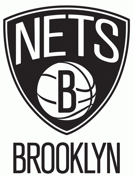
Armin of Brand New called a technical foul on the new Brooklyn Nets logo, I’d suggest a time-out instead. Of course, this new logo can not be considered as a slam dunk, but it is a definitive improvement from the old logo on my opinion.
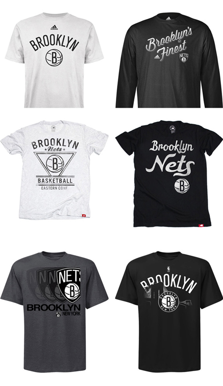
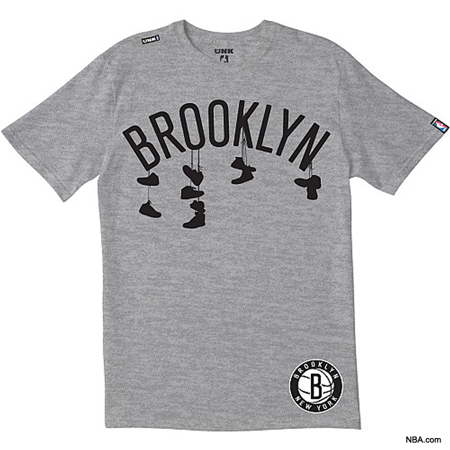
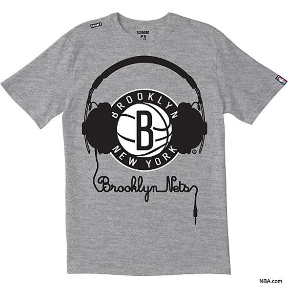
Graphically, some details on the typography would make any graphic designer cringe. However, the logo works well and it’s quite refreshing to see a NBA team logo that doesn’t use 2’000 gradients and fake 3D effects. Moreover, I find some of the t-shirts awesome.
What do you think of the new Nets logo? Fail or success?

