When you are a student in design school, designing brochures doesn’t sound like the most exciting task. Nevertheless, it can be a very interesting work if you are not working with brochure templates and let your creativity flow. In this post you’ll find a few things you should keep in mind to design better brochures.
Appropriate format
This is the very first step you’ll have to take when creating a brochure. You will usually discuss this with your client, so try to recommend the right medium for the message and type of product your client has to get across.
For example, a tri-fold or z-fold brochure will not be the best choice for luxury products that require lots of white space and big pictures. You will chose one of these narrow formats when you want to present documents that are easy to hand out.
Of course, it is better if you get creative with the format of your brochure. Nowadays many concert organizers create brochures that unfold into a poster. It makes it easy to send by mail, and practical to hang somewhere in the room to make sure the brochure stays visible all the time. The better looking the poster, the more people will hang it, so be artistic if you create this kind of poster.
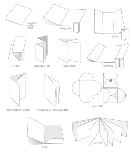
Some common brochure formats.
White space
This may sound like dull advice, because it could be given for any kind of graphic design project, not only for brochure design. It is however important to remember to keep some well-balanced white space on your brochure for the sake of aesthetics and readability.
I will not go over how to use white space in your designs, I’ll just assume that you know how to do it as a graphic designer. The problem you will run into will probably be that your client doesn’t understand the importance of white space. In that case, check out that post I wrote previously on Designer Daily.
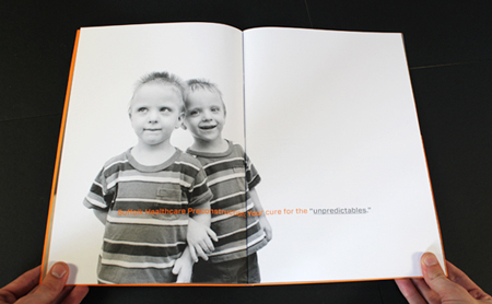
Example of white space from a brochure by Bluefish agency.
Quality printing
Design isn’t only about nicely layout pages, but also about the end physical product that people will hold in their hands. Brochure printing can sound quite boring, but if you know printing techniques well, it can seriously enhance your design.
Some of my favorite techniques, among others, are:
- Letterpress: the inked (or not inked) parts are pressed into the paper, thus creating a nice look and feel.
- Die Cut: irregular shapes created by cutting in the paper. It’s great to create some unusual effects.
- Varnish: a varnish layer that adds a glossy effect, my favorites are partial varnishes.
If you want to learn more about printing techniques, I suggest that you read this guide to printing techniques on Design Instruct.
The downside of most of these special printing techniques is certainly the cost. You will need to convince your client of the added value for his brochure if you want to use any of these.
Wise choice of colors
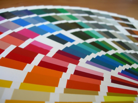
Again, this applies to most graphic design products, but the colors is the first thing that people will see on your brochure designs. Color conveys a lot more than just aesthetics, so it’s important to chose it wisely.
Unfortunatly, you will quite often not have much of a choice when picking colors, you’ll have to stick with the corporate identity guidelines of the company you are working for. Nevertheless, be very careful when chosing colors if you have total freedom in that matter. To become a bit better at picking colors, check out Johannes Itten’s book on color, it can be considered as the graphic designer’s bible about color.
Attention to typographic details
Most people who will take the brochure and read it will not notice if you kern the titles good or if your text is justified with perfect space between the words.
Some of the details you should pay specific attention to are: using ligatures, using thin spaces where appropriate, avoiding dumb quotes, avoiding widows and orphans. Of course there is much more to it, but I suggest you read a good typographic guide if you forgot about important typographic rules.
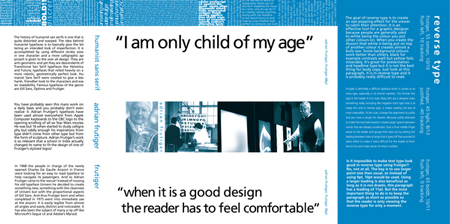
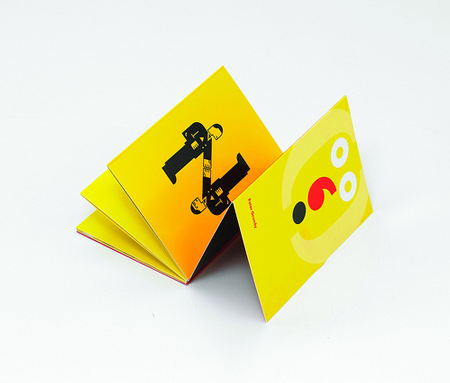
Typographic brochure by loretonoce.com.
Use the right paper
Paper is amazing. It can turn a boring design into something great. Try to convince your client to put some money on his brochure’s paper, because it’s well worth it.
Some of the high-end paper providers are:
- Gmund: a german company, their papers are amazing, check out the collection.
- Conqueror: one of the most famous brands, they have a great website to demonstrate their paper’s possibilities.
- Neenah paper: another great paper provider, I’m a sucker for their Astroparch paper.
Make sure that you get some samples to show your client, you must see and touch the paper to know whether you like it or not.
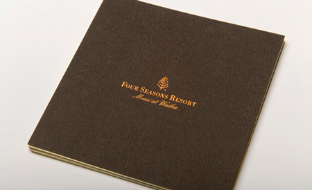
Brochure for Four Seasons Resort, printed on Gmund wood grain paper.

