It is estimated that only 3% of website visitors end up signing up to a newsletter, arranging a consultation or making a purchase on average. That means 97% of the time websites don’t do enough to be successful and help the business.
So how can you make your business website more productive with the web design fundamentals?
1. Mobile-Friendly Design
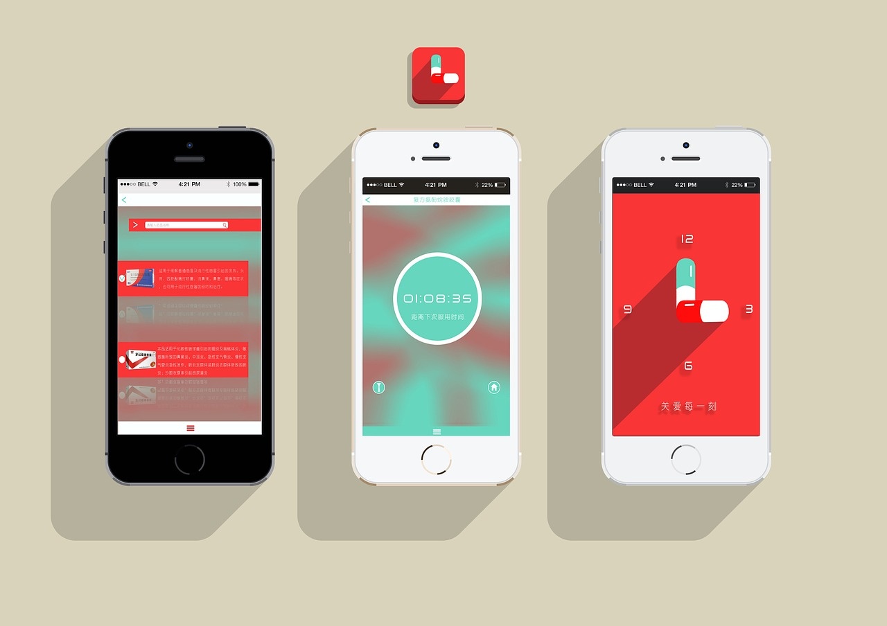
Websites are no longer just catering to laptop and desktop screens. We now have tablets, and smartphone internet searches are overtaking all other devices as well. This means the best websites need to be responsive on different screen sizes. Your products or services need to be easily understood on any device.

An example of this in action can be seen by by visiting any of the top gaming brands. Websites that allow you to play games and especially money games are put to a rigorous test by making sure that terms and conditions are stated, games load fast (to ensure a low bounce rate) and that they are mobile-friendly and render well on different devices. This is especially important according to a mobile designer we spoke to at PartyCasino, who explained that rankings and thereby sign ups can be heavily affected by a slow or badly-performing site and design.
2. Legibility
You want the information on your site to be easily consumable by visitors. The only way to ensure this is to make the content of the site legible. This means trialling fonts, font sizes and colours. A critical aspect of website design that people forget is that some viewers may have visual issues, such as colour blindness.
Make sure you pair colours well to avoid isolating some of your potential buyers!
3. Say NO to Autoplay
Have you ever visited a website recently and without clicking on anything, you are suddenly confronted with a video playing from the homepage? This is an autoplay feature, and it is incredibly annoying and distracting for most web users. Avoid having any autoplay features on your website if you want to keep visitors on your site for longer.
This doesn’t mean you should abandon videos. A video can bring a webpage to life and are great to be used as explanations of how a service works. Just don’t make it an autoplay video.
4. Visual Hierarchy
The hierarchy of a website and the visual hierarchy are not the same, but they are both crucial. The visual hierarchy is the visual cues that tell the website visitor – often subconsciously – in what order to consume the website. This may be done with:
- Headings
- Font sizes
- Positioning
- Colours
The overarching goal of visual hierarchy is to lead to your website’s main purpose or selling point, which could be a free consultation, subscriptions or a sale.
If you do want to make more sales, you may want to consider our website tips for increased conversion.
5. KISS Principle
Last but not least, use the KISS principle. KISS in this instance stands for Keep It Simple Stupid! By making sure your website is as simple as it can be, you make it more apparent to anyone who drops by. You’re more likely to be understood and get your messages across by having a straightforward website.
Unless you offer very complex services, having a simple website should be for everyone.

