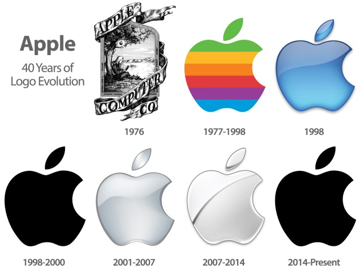
In our day and age, a company’s image is just as important as the functionality of its products. The fast-paced world we live in, the mushrooming more brands and the overload of information, all require intelligent design processes that ensure a brand’s uniqueness and longevity. Successful companies such as Apple or Coca-Cola have long proven the paramount status of a brand’s image, and more and more companies are measured first and foremost by their creative accomplishments.
According to a recent Forrester report, businesses that put their main focus on design and customer experience have seen increases in revenue by as much as 36%. In addition, almost half of all design-driven companies have managed to exceed their business goals for the year 2017. This goes to show that the role of design is becoming increasingly important, no matter the size of the business. Here are a few important things to keep in mind when it comes to your company’s image.
Designing a Brand Logo
Design does not only fulfill certain functional needs of a customer but also emotional ones. As a matter of fact, many people make their purchase choices solely based on the design experience. It is what people remember and recognize and how they establish an emotional bond with a specific brand. A brand’s design is therefore a powerful marketing tool and should always be well-considered.
The logo is the most crucial element of a brand’s overall image. It is essentially the face of the company and the icon that stands for everything connected to it. Brand logos should be:
- Easily recognizable
- Flexible and adjustable
- Unique and innovative
The golden rule is: Less is more. Naturally, a brand logo should always be original and stand out from its competitors, yet the simpler the design, the better the logo. Always keep in mind that a brand’s icon will appear in many different places, be put against different backdrops and reproduced in various sizes and formats. Too much detail in the logo’s design will easily be lost. The most successful brand logos are usually known for their simplicity, which makes them instantly recognizable and reproducible.

It is also vital to create an icon that is flexible in the sense that you can make minor alterations over the course of time to keep it up to date. For instance, one might want a “fresher” or “younger” look for their company at a certain point, so make sure this is also feasible with the logo. Choose a contemporary design over a trendy one. Whereas the latter is likely to go out of style within a matter of years, a contemporary design will still be interesting even after a long time. Starbucks, for example, actually dropped all words from its logo in 2011, relying on the iconic mermaid image to represent the brand. Interestingly, Gap attempted to update its logo in 2010, only to revert back to its original design after a public backlash.
Flyers, Posters and Brochures
Despite the almost endless amount of software tools and templates which make it fairly easy to design posters, flyers and other marketing tools, there is much more to creating a truly powerful design. The design should always be:
- Simple
- Memorable
- Inventive
- Of high quality
For instance, before getting leaflet printing done through a place like print24, make sure to select the highest possible quality for print and paper to increase the design value. This is because anyone accepting a leaflet from someone on the street or finding one in a café definitely won’t be tempted to read the information if the presentation is poor.
The design itself should always be kept basic. An overload of information is not going to have the desired impact, but is most likely going to deter the reader from having a closer look. Nothing should be left to chance and every detail of the design should serve a purpose, from color to layout to font.
Keep in mind that it doesn’t take much to catch the attention of your target audience, as too much information will most likely put them off. Overall, if you think the design of something as trivial as a flyer has no impact on your business, then you’re wrong. Image is everything, and every aspect of your company should be treated equally, from the logo all the way down to a business card.

