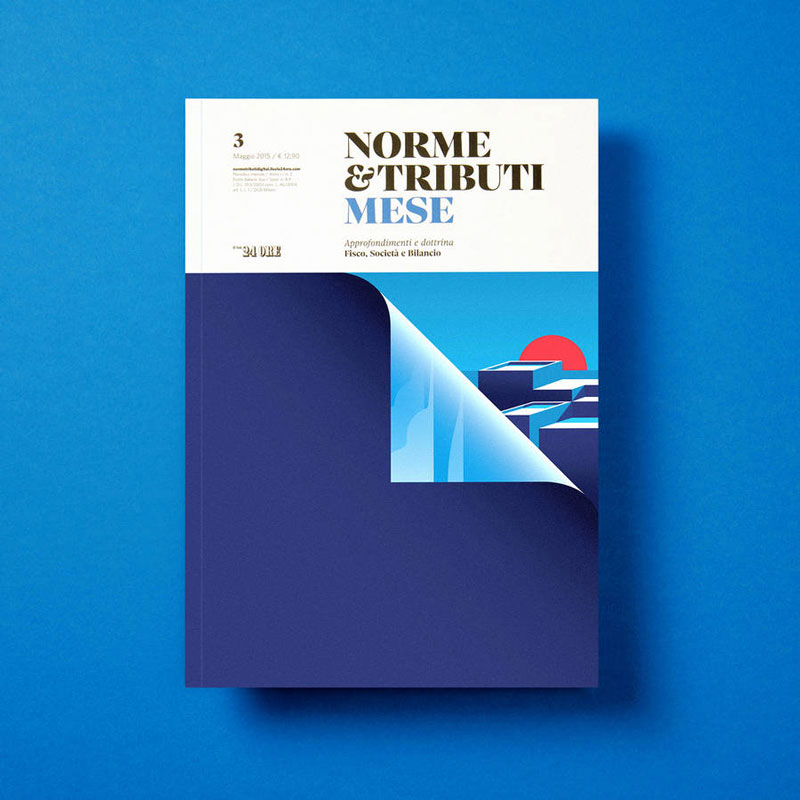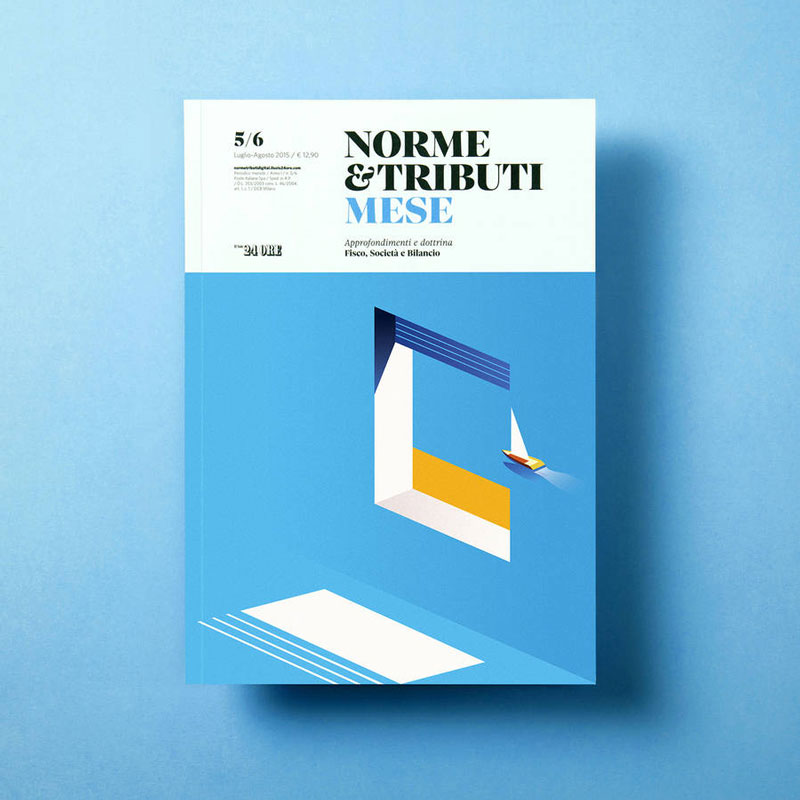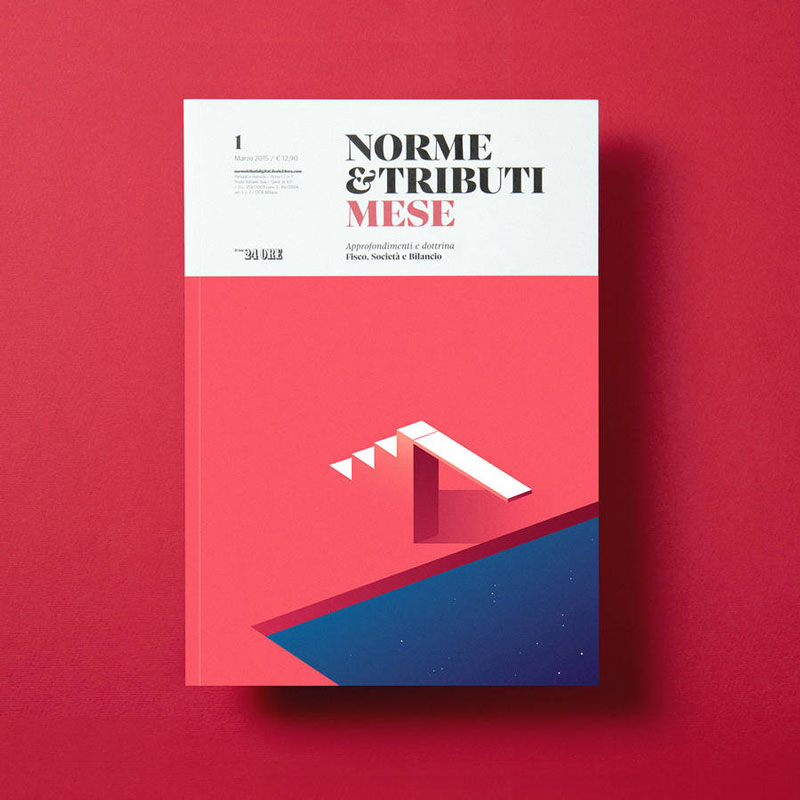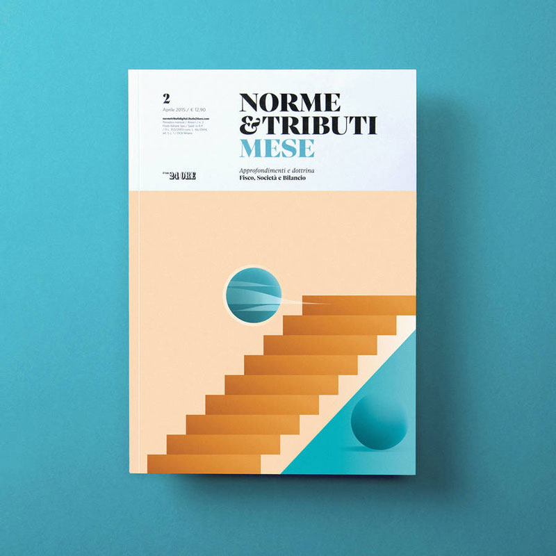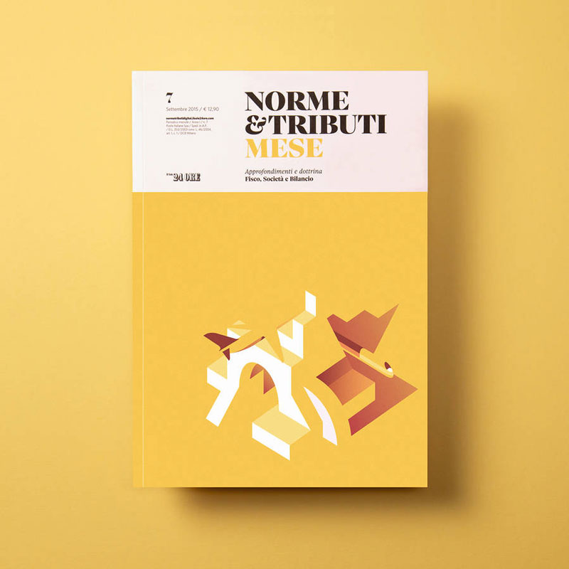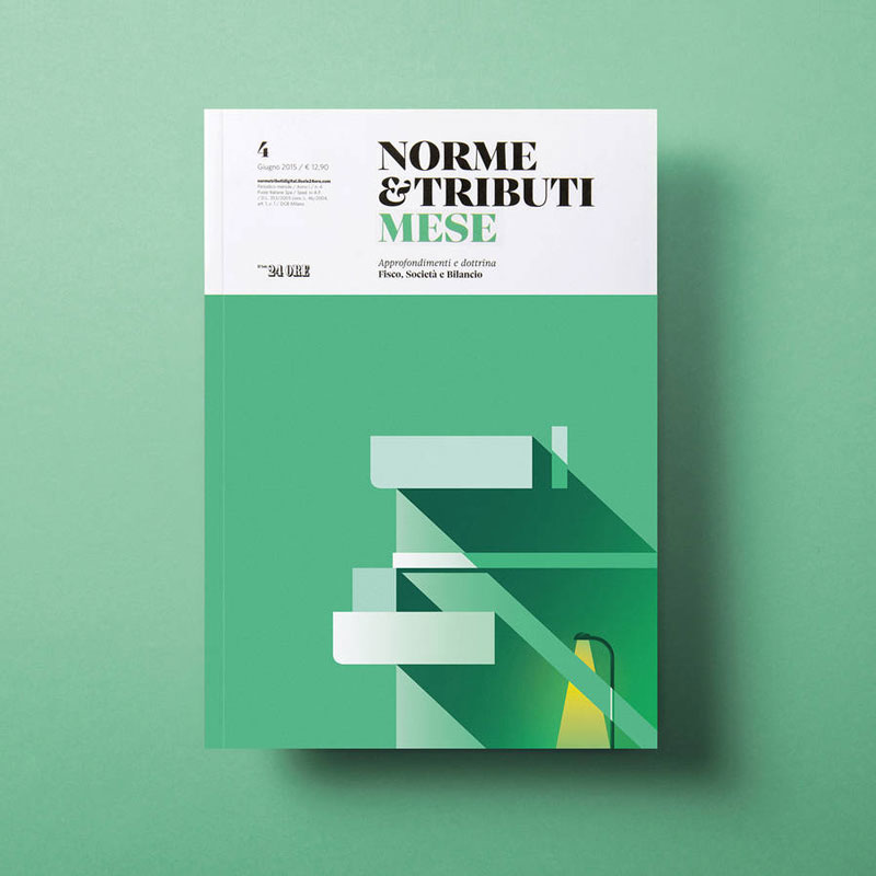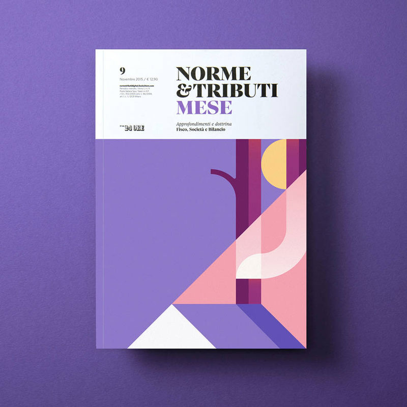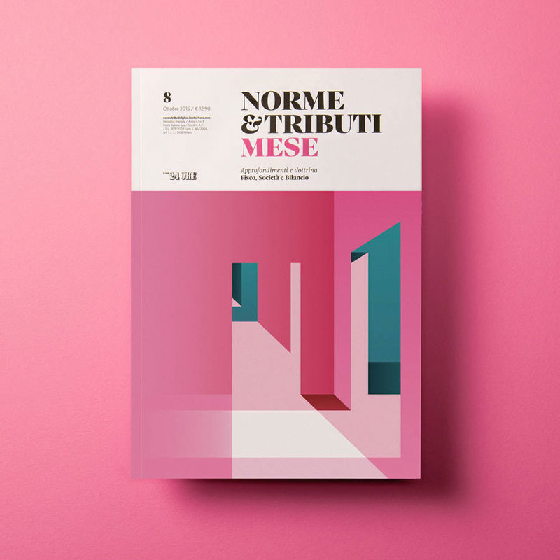
Grid-based design with nice typographic hierarchy, check. Gorgeous Didone typeface for the title, check. Awesome, catchy, and colorful illustrations, check.
I’d love to find something that’s not perfect with these covers for the Italian Economic Revue, but in my opinion they are flawless. The illustrations are the work of the talented Italien illustrator Ray Oranges. Now go find me a hipsterish design magazine that has better covers than this…
