In the 1970s, McDonald’s was at a pivotal point in its growth, and the fast-food giant sought to enhance its brand identity. To achieve this, McDonald’s engaged Unimark International, a prominent design firm, to explore a comprehensive redesign of its packaging and signage. This collaboration aimed to create a more cohesive and appealing visual identity for the restaurant chain.
Unimark’s Approach
In 1973, Unimark conducted extensive studies of McDonald’s operations. They analyzed various aspects of the restaurants, interviewing employees, managers, and customers to gather insights into the brand’s strengths and weaknesses. One of their primary focuses was on improving packaging and ensuring that signage across all locations maintained a consistent look and feel.

Key Findings
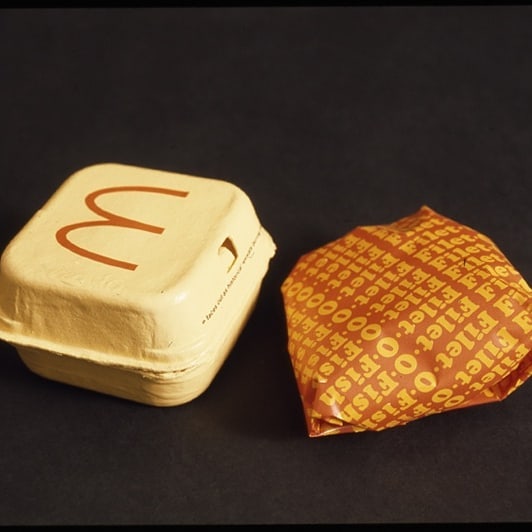
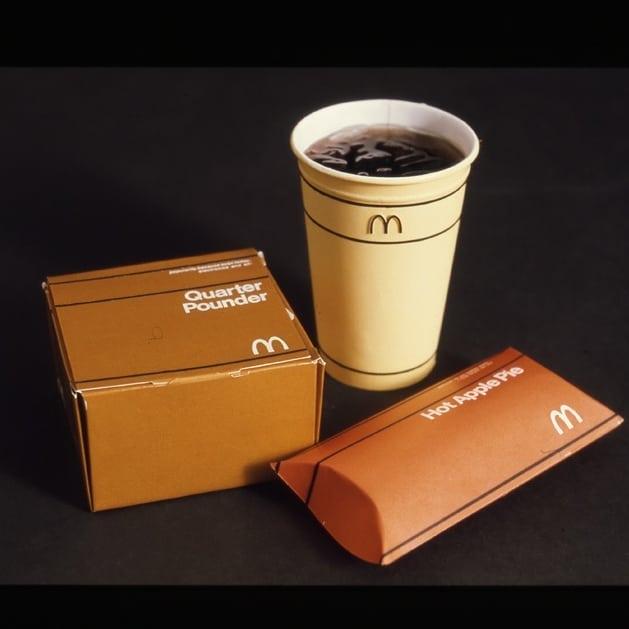
- Packaging Love: Unimark discovered that the apple pie packaging was particularly well-received by customers. This insight highlighted the potential for creating packaging that resonated with consumers while also enhancing the overall dining experience.
- Signage Consistency: The firm emphasized the need for uniformity in signage throughout McDonald’s locations. They believed that a consistent visual language would strengthen brand recognition and improve customer navigation within stores.
- Brand Symbol Usage: A notable recommendation from Unimark was to reconsider the placement of the iconic McDonald’s symbol on trash cans. The design team questioned whether it was appropriate for such a prominent brand element to be associated with waste disposal, suggesting that it could dilute the brand’s image.
- Uniform Design: Unimark also critiqued McDonald’s employee uniforms, stating they were “not exciting enough.” The firm proposed redesigning uniforms to reflect a more vibrant and engaging aesthetic that would align with the energetic atmosphere of McDonald’s restaurants.

The Refusal of Unimark’s Redesign
Despite the thorough research and innovative proposals presented by Unimark, McDonald’s ultimately decided against implementing their redesign suggestions. The refusal was likely influenced by several factors:
- Brand Identity: At that time, McDonald’s had already established a strong brand identity that resonated with its customer base. Any significant changes could risk alienating loyal customers who were accustomed to the existing look and feel.
- Operational Considerations: Implementing widespread changes across thousands of locations would require substantial investment in new materials, training for staff regarding new uniforms, and adjustments to existing signage.
- Corporate Culture: McDonald’s corporate culture may have favored maintaining control over its branding decisions rather than outsourcing them to an external agency like Unimark.
Legacy of Unimark’s Vision
While Unimark’s redesign proposals were ultimately shelved, their insights into customer preferences and branding strategies have had lasting implications for how fast-food chains approach design today. The emphasis on cohesive branding, customer experience, and thoughtful packaging continues to influence modern marketing strategies across various industries.In retrospect, one can only wonder how different McDonald’s might have looked had they embraced Unimark’s vision in the 1970s. The potential for a more unified brand experience could have set new standards in fast-food branding—one that might still resonate today.
About the Author

Mirko Humbert
Mirko Humbert is the editor-in-chief and main author of Designer Daily and Typography Daily. He is also a graphic designer and the founder of WP Expert.