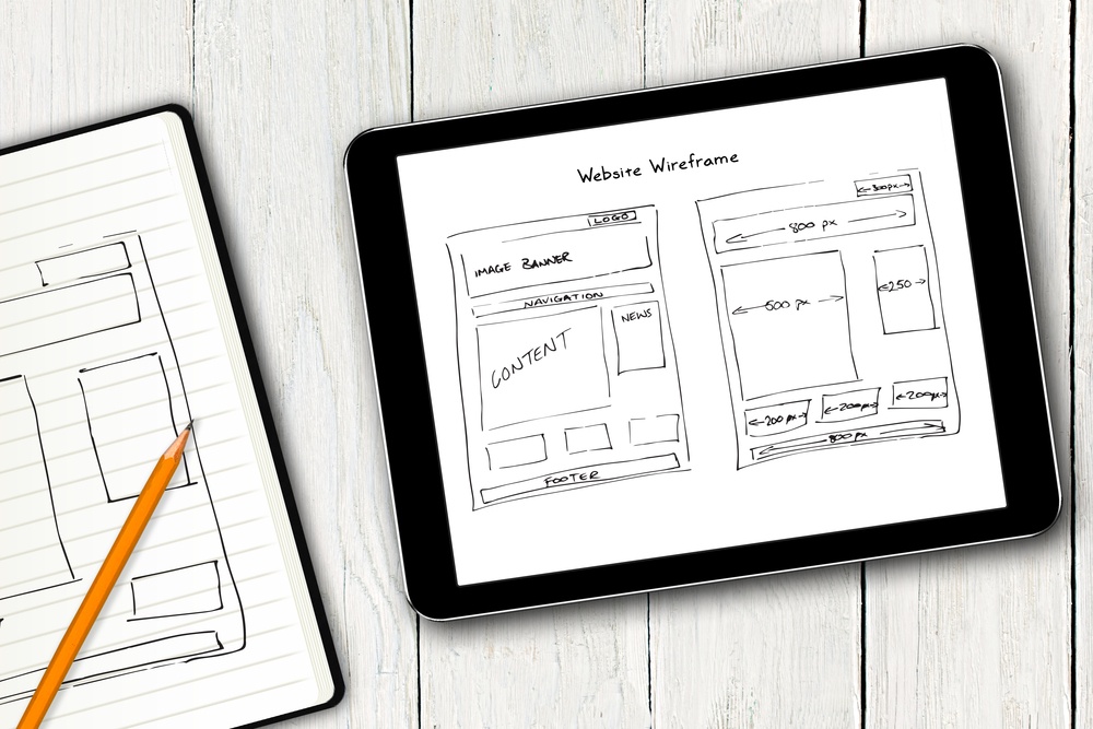
Are you planning to build a website in 2020? Whether it’s a business website or an avenue to show your passion to the world, wireframes will serve as the foundation on which you can begin building a site of any shape or size. Once you’ve determined the architecture of the site using a flow chart or a site map of the web pages, wireframing comes next. Thus, it’s ideal to do wireframing before starting the creative design phase.

So, what are wireframes? These are simple black and white layouts that help you outline the specific placement and size of page elements, conversion areas, site features, and website navigation. Wireframes are devoid of color, logos, font choices, or any real design elements to let you focus on the website’s structure purely.
Websites are like homes; you need blueprints in constructing them. It allows you to easily see the structural placement of the electrical, plumbing, and other structural elements. This is what wireframes can do for your website. It helps you ensure that all the web design best practices get implemented in the designing and building process.
Read on below to learn more about the value of wireframes in web design:
Helps In Creating Site Navigation Designs Better
Content findability should be one of the top priorities in web design. That said, intuitive site navigation is a must. The last thing you’d want is for your site visitors to get lost because they can’t quickly get to where they want to go on your website. If that happens, you lose them after only a few seconds, making your business lost some potential leads.
Users have become increasingly web-savvy nowadays, so shoddy navigation becomes a primary reason for adverse impacts and discontent. The problem is that developers, designers, and clients find it challenging to evaluate navigation until they get the opportunity to use it. It’s where wireframes get in the scene.
Wireframing allows all parties to test run a new site, which gives everyone the chance to see how difficult or easy it is to locate pages. It also helps them determine whether dropdown menus confuse or clarify the user. Additionally, wireframing allows everyone to understand whether the navigation scheme is incomprehensible, intuitive, or somewhere in between.
Again, the implementation of design changes can be expensive, so you’d want to make sure that everything gets done in line with the ideal experience you want users to have. It applies to anyone who has a website, whether you’re going to sell e-commerce products or level up your podcast show art.
Content findability will make you succeed, and you can achieve it with better site navigation designs.
Allows You To Visually See The Site Architecture
As already mentioned above, wireframes turn your site map into something tangible and real without distractions. Flow charts can be huge and a bit abstract, so you need wireframes for a concrete visual process of the web design project. Thus, the wireframing step ensures that the client and the designer are on the same page.

As a business owner who plans to outsource the design process of your website to experts, wireframes allow you to focus on what you want early on and relay your ideas to your web designer.
As a website builder, on the other hand, wireframing allows you to walk your clients through your proposed design structure without them getting distracted by images and colors. Wireframing gives both the web designer and the client a chance to meet halfway in deciding which elements to include on the different pages, and how each aspect should function on the site. Thus, wireframes make everything straightforward for both parties.
Makes Web Design Changes More Efficient
It takes expertise, effort, and time to create a website design. When clients see the finished design, what they see is a product of hard work, and they know that revising the work will involve considerable expense. However, changes are inevitable. Every web development project undergoes multiple changes.
The more time and the less accurate you are when it comes to design changes, the larger the expenses become. So, what can you do to make everything more efficient? You can review the wireframes of the website!
Wireframes can help make changes get reworked in only a matter of minutes. Don’t like the header size? Make it smaller. Too small for you? Try adjusting it a hair bigger. Is the zone of conversion gets overshadowed by the logo? Implement some adjustments to make it look the way you wanted it to be.

