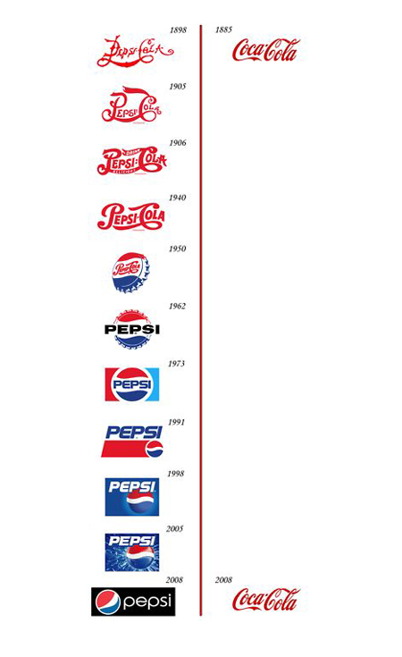
I saw this image a few days ago and like most designers I found it interesting. Even though the image here cheats a little (Coca-Cola logo looked different in early days), it shows in a glimpse how persistent branding gives a more stable image to the company. If you have such a recognizable and iconic brand, there are companies that specialize in rebranding so it’s probably best to work with one of them so you don’t lose that classic look and feel, which can alienate your existing audience.
It also shows two mistakes you often see in branding:
- Copying the industry leader, or being obviously inspired by him, which is pretty much the same…
In its early days, Pepsi seemed to be very eager to give its product the same kind of branding as Coke, not sure it’s the best way to differentiate yourself from the industry leader. - Using a time-sensitive item in your logo
In 1950, Pepsi used a bottle capsule that has been abandonned afterwords. This is quite risky in terms of branding, since obsolete objects will force you to do major redesign to get rid of it.

