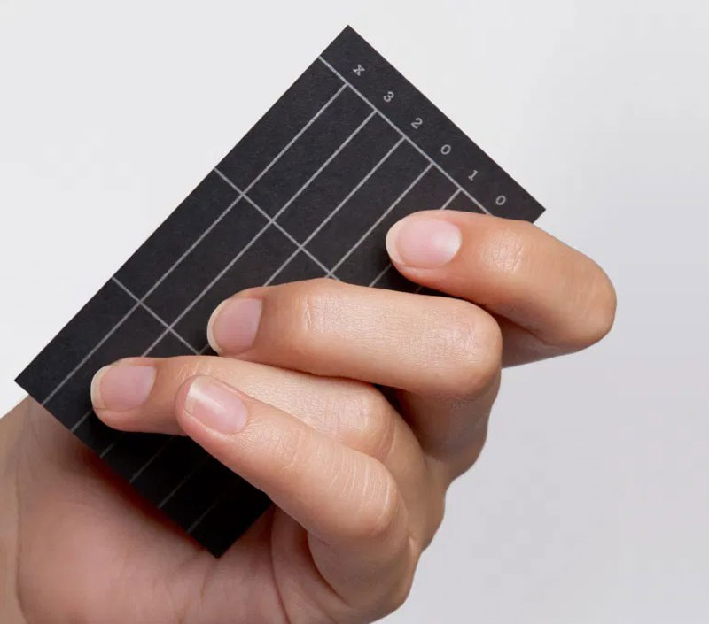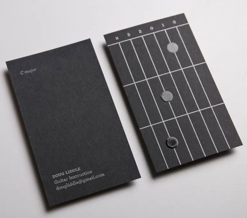
Doug Liddle is a guitar instructor who had the good idea to hire a creative graphic design to do his business cards. The design, Rory O’Sullivan, actually designed more than one card, as he used one side to teach Liddle’s contacts how to position their fingers to plays chords.
As a result, on one side of the cards, you have a pretty standard business card, with just the necessary data. On the other side, you get a different design every time, with the little dots positioned in a way that shows you where to put your fingers.
Once again, this is a brilliant display of creativity that proves that having good ideas is sometimes better than having a big budget for marketing.


