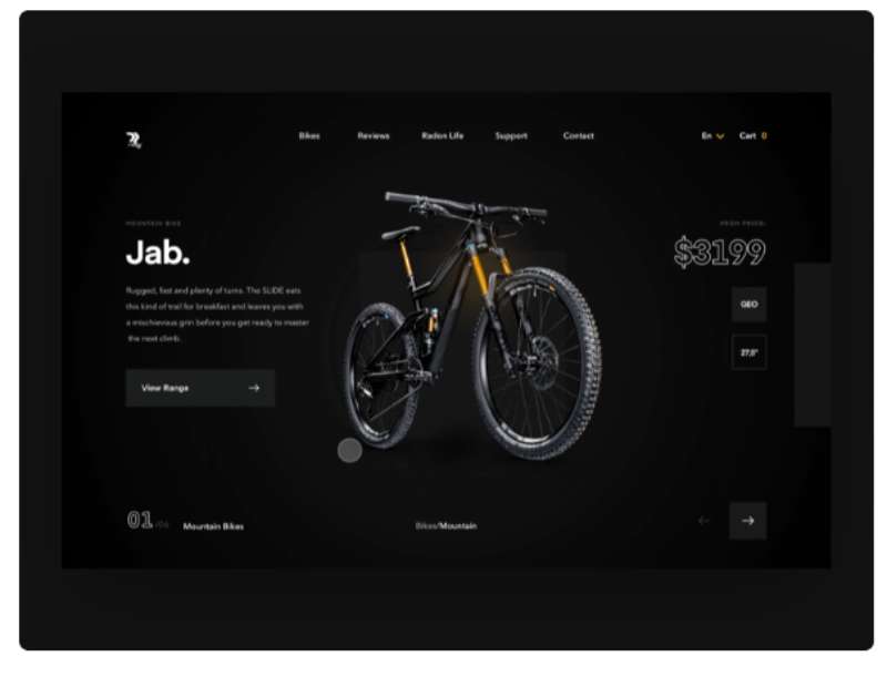
Have you ever clicked on a link and instead of an abrupt cut, you saw a smooth animation that took you from one page to another?
That’s what we call animated page transitions.
They’re the magic carpet rides of the web world, taking your users on a seamless journey through your site.
Why Animated Page Transitions Matter

In a landscape where user experience is king, these transitions offer something beyond functionality: they offer a feel, a vibe.
They create a story out of your website, making every click a plot twist that keeps your user hooked and engaged.
Now let’s get down to the real stuff, shall we?
Understanding the Basics of Animation
A Quick Look at Animation in Web Design
Animation has been the spice of web design for a while now.
Remember the early days of the internet?
You’d see blinking texts, crawling marquees, and if you were lucky, a spinning logo! Fast forward to now, and it’s a whole different ball game.
We’ve got sliders, hover effects, parallax scrolling, and of course, animated page transitions.
The Many Faces of Animation
There are many types of animations, from subtle micro interactions like button hovers, to major shifts like full page transitions. Some are purely aesthetic, while others have practical purposes.
The Ups and Downs of Using Animation
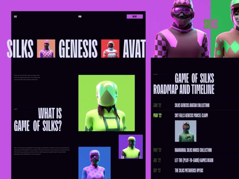
Like all good things, animation has its pros and cons.
On one hand, it can enhance user experience, make your site more engaging, and guide your users’ attention.
But on the other hand, too much animation can be distracting, and can slow down your site if not implemented properly.
Principles of Animated Page Transitions
Timing and Duration
Getting the timing and duration right is crucial for a smooth transition.
Too fast, and your user might miss it. Too slow, and they might get bored. The trick is to find the sweet spot.
Easing and Spacing
In the world of animation, easing refers to the rate of change in an animation.
It’s what makes animations feel more natural and less robotic. Spacing, on the other hand, refers to the distribution of frames over time.
Sequence and Choreography
Animation is a dance, and like all dances, it needs good choreography.
Which element moves first? Which one follows? What’s the sequence?
These are all important questions to answer when designing your page transitions.
Tools for Creating Animated Page Transitions
CSS Transitions
CSS is one of the most basic tools for creating animations. With just a few lines of code, you can create simple yet effective transitions.
JavaScript Libraries
If you want to level up your animation game, JavaScript libraries like GSAP or anime.js can give you more control and flexibility.
Other Useful Tools
Apart from CSS and JavaScript, there are also tools like Framer Motion and React Spring that can help you create stunning animations.
Step-by-Step Guide to Creating Basic Animated Page Transitions
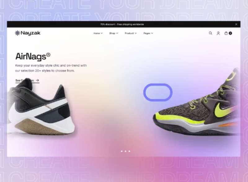
Plan Your Transition
Before you write a single line of code, it’s important to plan your transition.
Sketch it out, make a storyboard, or just visualize it in your head.
Code Your Transition
Once you have a clear vision of your transition, it’s time to bring it to life with code.
This could involve CSS, JavaScript, or a combination of both.
Test and Debug
After coding your transition, test it on different devices and browsers to make sure it works smoothly. If you encounter any issues, debug and refine your code.
Advanced Techniques in Animated Page Transitions
Using 3D Transforms
Ever wanted to add an extra dimension to your web pages? 3D transforms can do just that.
They can rotate, scale, and move elements in 3D space, giving your transitions a depth that 2D animations can’t match.
Incorporating SVG Animations
SVGs (Scalable Vector Graphics) are a game-changer. They’re resolution-independent, meaning they look sharp on any screen size.
And the best part?
You can animate them! SVG animations can add a unique touch to your page transitions.
Exploring Parallax Scrolling
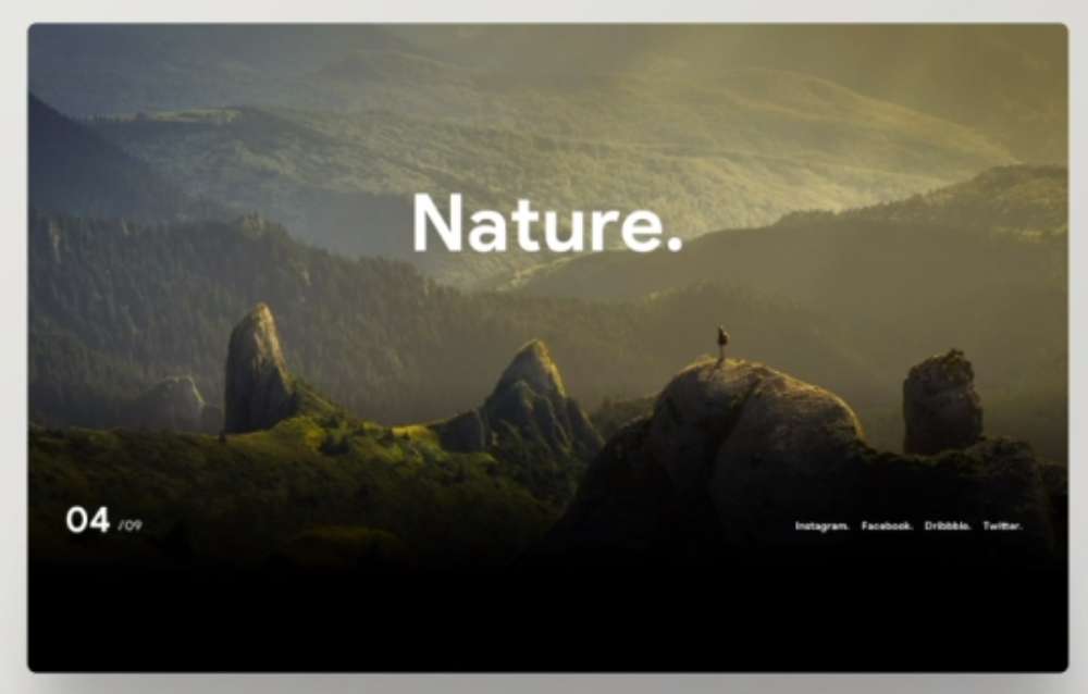
Parallax scrolling is where background images move slower than foreground images, creating a 3D effect as you scroll.
It can make your page transitions feel more dynamic and immersive. You’ll usually find this effect on photographer websites.
Common Mistakes to Avoid in Creating Animated Page Transitions
Over-Animating
Animation is like spice. A little can add flavor, but too much can spoil the dish.
Over-animating can overwhelm your users and distract from your content.
Ignoring Accessibility
Animations can be a problem for people with certain health conditions.
It’s important to consider accessibility when creating your animations and provide options to reduce or disable them.
Neglecting Performance
Animations can slow down your site if not optimized properly. Always keep performance in mind and strive for animations that are smooth and fast.
Best Practices in Animated Page Transitions
Consideration of User Experience
Always put the user first. Your animations should enhance the user’s journey, not hinder it.
Ensuring Responsive Design
Your animations should look and function well on all devices and screen sizes.
Prioritizing Accessibility
Accessibility is not an afterthought. Consider it from the beginning and make sure all your users can enjoy your site.
Conclusion: Harnessing the Power of Animated Page Transitions
Recap of the Main Points
We’ve covered a lot of ground, haven’t we?
From the basics of animation to advanced techniques, from common mistakes to future trends.
But the key takeaway is this: animated page transitions, when done right, can enhance user experience and make your site stand out.
Final Thoughts on the Importance of Animated Page Transitions
Animated page transitions aren’t just a trend or a gimmick.
They’re a powerful tool that can give your website a unique personality and a smooth user experience.
They can transform your site from a static collection of pages into a dynamic, interactive journey.
Encouragement for Continuous Learning and Adaptation in the Field of Web Design
Web design, like any creative field, is always evolving.
New tools, techniques, and trends emerge all the time. As designers, it’s our job to stay informed and adapt to these changes.
Learning to create animated page transitions is just one step in this journey.
So keep learning, keep experimenting, and most importantly, keep creating. Who knows, you might just create the next big trend in web design!

