The start of a new year ushers in innovative and significantly better website design practices. The year 2023 will feature a fascinating variety of new website trends, including ones that target larger scale scenarios and difficulties such as accessibility, user experience, and responsive design.
In the following piece, we’re going to take a look at the five most recent trends in website design, along with ten pre-built websites from BeTheme that demonstrate how to put those trends into practice.
BeTheme is one of the most widely used and well regarded WordPress themes available, boasting over 268,000 sales and an overall rating of 4.83 out of 5 stars.
5 emerging trends in web design for the year 2023
Web designers need to consider a broader range of factors, including those that have an impact (both positively and adversely), on the experiences their clients have when interacting with digital platforms. The following trends in website design for 2023 will address these more fundamental concerns:
1. Iconography that can be hovered over
When it comes to web design, one of the most important goals is to develop user interfaces that are so simple and straightforward that virtually anyone can use them. However, the adoption of certain shortcuts in web design, particularly when it comes to iconography, might provide challenges for some users and reduce accessibility.
There are certain icons that can only be interpreted in one way. For example, icons that are used in the heads of websites have become so frequent that the vast majority of users, if not all of them, are aware of the function that they serve and what will occur when they click on the icons.
On the website for BeBiker 4, for instance, there are three icons on the left side of the page for the following: a shopping bag/cart, search, and an account.
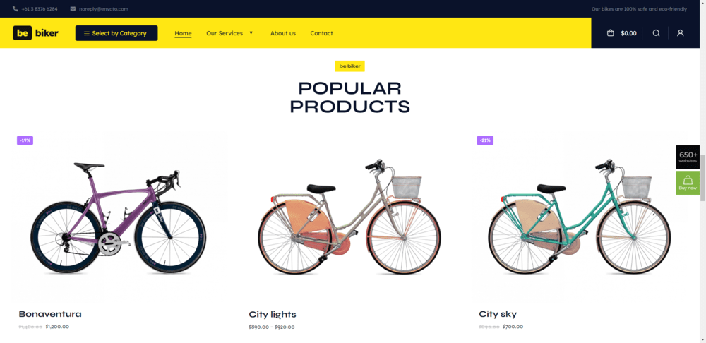
Users won’t be confused about how to use this component of a website header as long as the same iconography is used across all of the sites.
When it comes to other icons that are used less frequently, however, you need to take into consideration the variety of your users and the ways in which they may have diverse interpretations of those icons. In 2023, web designers will begin to incorporate hover-triggered helper text above symbols when it is necessary in order to boost user trust while interacting with website iconography. This will be done in order to improve the overall user experience.
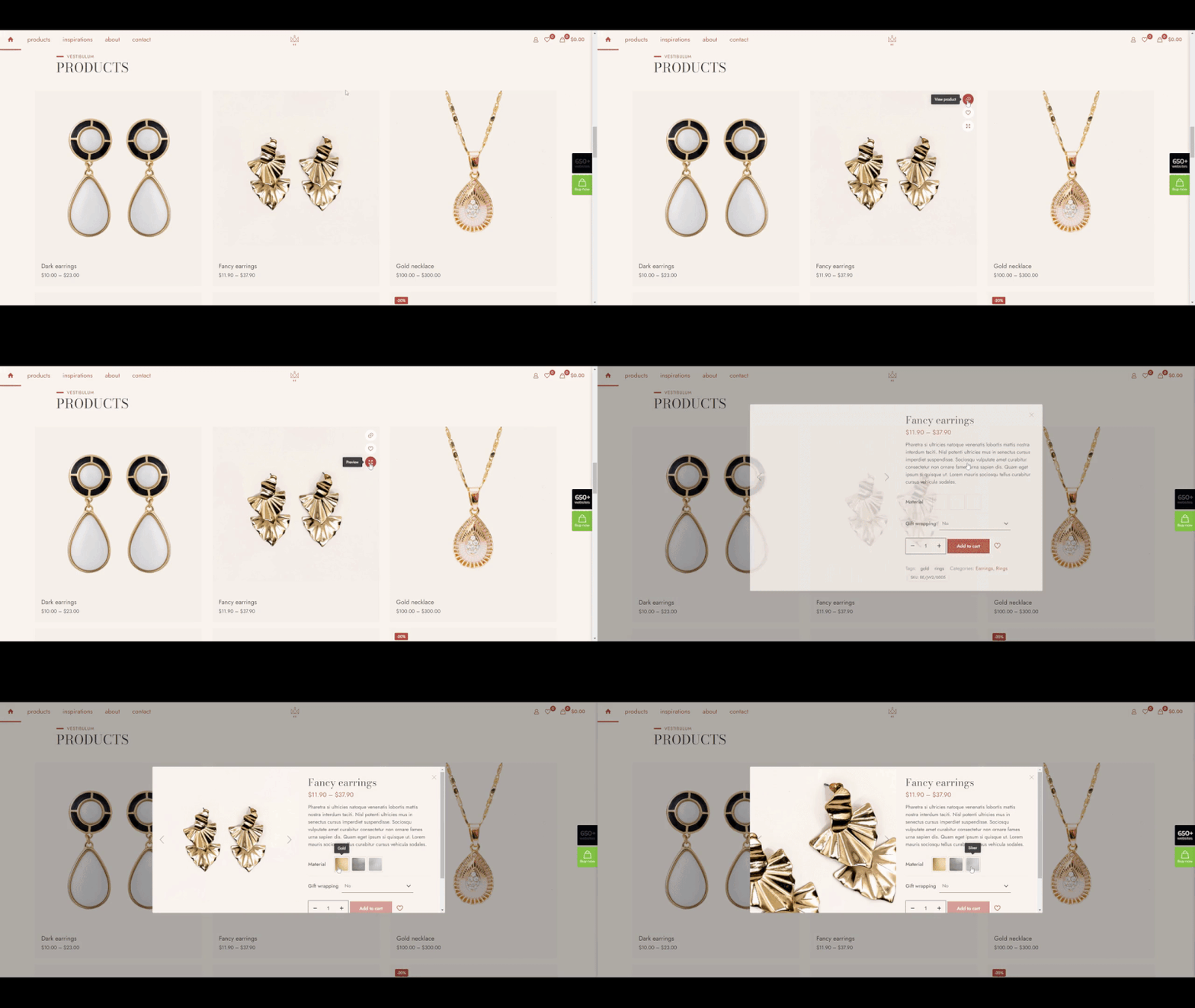
On the BeJeweler 2 website, you can see an illustration of one example of this trend:
Customers are given additional information as they move their mouse pointer over product icons and color swatches to see the available options. This eliminates any room for ambiguity, and from this point forward, all visitors can use the site’s content with confidence.
2. More social proof
Building relationships on a foundation of trust is essential, whether those relationships are personal or professional, as is the case with businesses and their interactions with their respective audiences.
Because of the importance of the website as the initial point of contact between customers and companies, the establishment of trust should start there. In the year 2023, site designers will use social proof and trust marks as a means to do this.
These trust builders can be implemented on websites in a variety of different ways. One of the most typical approaches is to include a page on the website as well as a part on the home page that is dedicated to real client testimonials and/or reviews, as is the case with the BeDoctor website:
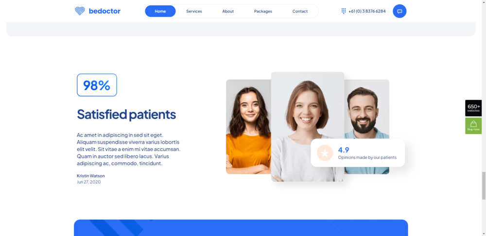
In this example, we will look at three types of material that may help build trust among website visitors:
- A percentage of happy customers as a whole
- A customer endorsement
- A general user rating that can be connected to an external ratings service, such Google or Yelp.
For some businesses, it’s still too soon to have amassed a sizable amount of social proof; hence, you have nothing to showcase on the site at the moment. Trust marks are the way to go in this case.
Security seals, like a symbol placed next to the “Checkout” button, are one kind of trust indicators that can reassure customers that their transactions on your site are protected. As shown by BeMarketing 2, providing background information to back up claims made on a website is another option for boosting credibility and trust:
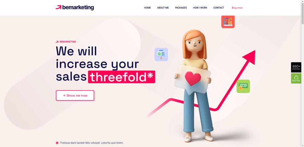
The allegation indicated by the asterisk in the headline is elaborated on in the following paragraphs. You may either use this place to provide a disclaimer or include a link to a page that demonstrates that the claim is supported by evidence by using this space.
3. Mobile-specific features
With each passing year, the fundamental ideas underpinning responsive design become more well known, making it easier to execute. In addition, most WordPress themes are built with responsive design in mind out of the box, which takes a lot of the guesswork out of the design process.
On the other hand, this has resulted in a level of complacency with regard to the design of mobile websites. Web designers are not particularly encouraged to come up with unique methods to make responsive websites even greater, despite the fact that responsive websites give a positive experience for users.
This will shift by 2023 as a result of more focus being placed on the quality of the mobile experience. More specifically, the process that designers use to develop features that overcome difficulties and friction that are unique to mobile devices.
This will be reflected, for example, in the manner that the navigation design is constructed. Take, for instance, the pre-built website that comes along with BeLanguage 4:
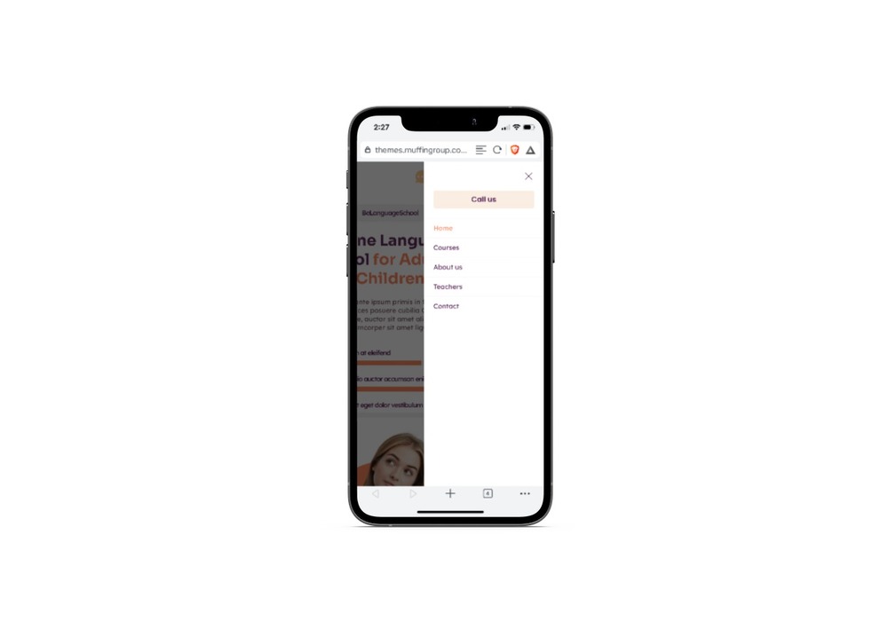
All of the page URLs from the standard website that is not optimized for mobile use are available here. On the other hand, the button labeled “Call us” can be found at the very top of the list of links when viewed on a mobile device. It is displayed at the very bottom of the desktop version.
When designers review the data they have on user behaviors and goals for the many devices they use, we will see tiny variations in the way that important components like navigation are created. These variations will occur as a direct result of the evaluation.
In the year 2023, an increasing number of websites will have features that are reminiscent of mobile applications. This action has been taken by BeFurnitureStore. Instead of retaining the multi-level header style from the desktop site, the top bar that holds the links to the account, cart, and favorite pages is now displayed as a sticky bottom bar:
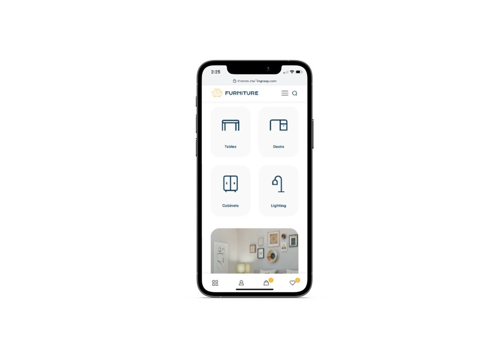
In the years to come, web designers who are able to modify and revolutionize the experience of using the web on mobile devices will be in a position to position their websites as superior services.
4. Texturization of the forms
Skeuomorphism is credited with bringing a variety of real-world textures to the screens of our computers and mobile devices many years ago. As time went on, however, people began to view these textured backdrops as unnecessary and intrusive, and as a result, the trend in design began to fade away.
The fact that a particular approach to web design has recently fallen out of favor does not, however, make the idea of digital texturization a bad one to begin with in and of itself.
In 2023, web designers will experiment with using organic shapes to provide subtle and, more importantly, strategic textures to their designs. These textures will be added using organic shapes. The incorporation of organic forms will result in the creation of these textured elements. You may view a sample of something similar to this on the website for BeRenovate 5, which is as follows:
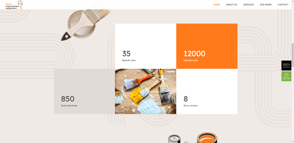
On each page of the website, the background features rounded shapes and lines in various configurations. They add visual appeal to the UI without drawing too much attention away from the overall design.
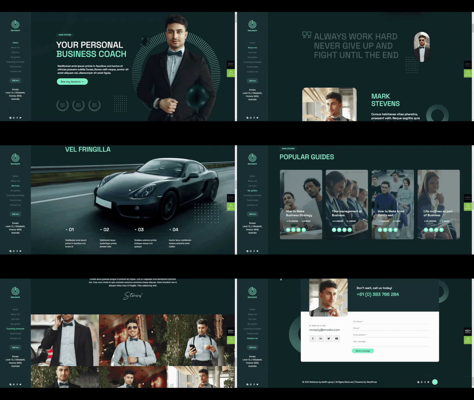
Texturization done digitally might also be used for strategic purposes. BeCoaching 3 is a wonderful example of how to focus the attention of readers to specific portions of your pages, including but not limited to:
The single-page website makes use of two different shapes throughout its entirety. Because of the uniformity of the texturization, it will be much simpler for you to guide the attention of your visitors to the location you like.
Forms will often be located closer to the right margin of the page, but this is not always the case. Because users’ eyes have a tendency to be drawn to the left side of the screen, these shapes are designed to increase the quantity of content that users see and engage with by capitalizing on the fact that users’ eyes are drawn to the left edge.
5. Supplemental video
Users have a variety of preferences when it comes to the manner in which they consume content while using the internet. People who want to read anything but don’t have a lot of time could find it helpful to read blogs, for example. On the other hand, video posts, sometimes known as vlogs, are fantastic options for readers who like to watch or listen along.
Having said that, it is unrealistic to assume that you would be able to supply an audiovisual alternative to each and every piece of material that you upload to your website. To begin, if you are trying to provide a more personalized experience for the user when they are consuming material, the design could very easily go out of hand. In addition, videos are typically large files, and the more of them you add to a website, the more likely it is that loading times will increase.
In 2023, designers will only incorporate an additional or alternative video when the situation warrants it, which will be referred to as “video only when it matters.”
For instance, the home page of the website for BeBusiness 6 features a full-width video area approximately halfway down the page. It’s almost impossible to turn a blind eye to:
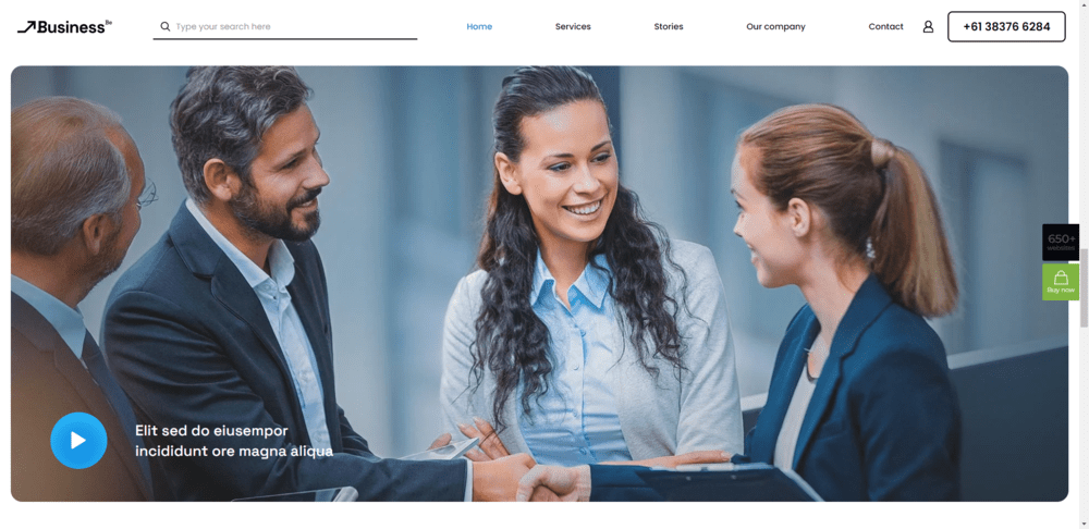
This video clip can be utilized in a broad variety of settings and for many different reasons. for the purpose of displaying video testimonials. to provide a summary of all the material that was presented in the prior stages. should present a clear and concise explanation of the most complex technical features of the product, which must also be easy to comprehend. And this continues to happen.
In addition, the usefulness of additional video does not need that it take up a sizable quantity of storage space. For instance, the “hero” section of the BePregnancy website has a very little cutout that leads to the location of the video:
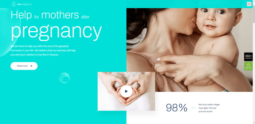
Visitors who click the instantly identifiable button labeled “Play” are informed that there is content available for them to watch (if that is what they intend to do). One more time, this content is useful for a wide variety of applications.
In addition, web designers can assist in accelerating the rate at which web pages load by making use of video selectively and wisely, while also avoiding the use of autoplay video backdrops and parts.
What are your thoughts on the current trends in website design?
Most of the time, lists of web design trends focus on the superficial changes that will take place on websites, such as exciting color trends, experimental typeface uses, animation and special effects, and so on. In the year 2023, however, web designers are likely to devote a greater portion of their time to concentrating on trends that lead to more significant user engagements and overall improvements to the web.
Accessibility, responsiveness, and the cultivation of trust are not straightforward issues. Having said that, the websites you create with BeTheme will appear straightforward due to the fact that the majority of their components have already been incorporated into the more than 650 pre-built sites that are available with the WordPress theme.

