At the core of communication, there is the need to transmit a message. Images are powerful for that and can convey some things better than letters. In my opinion, typography is still the best way to communicate when it becomes more than simple letters, but an image in itself.
This selection of typographic posters is an excellent example of typography layed out to become the most powerful way to communicate.
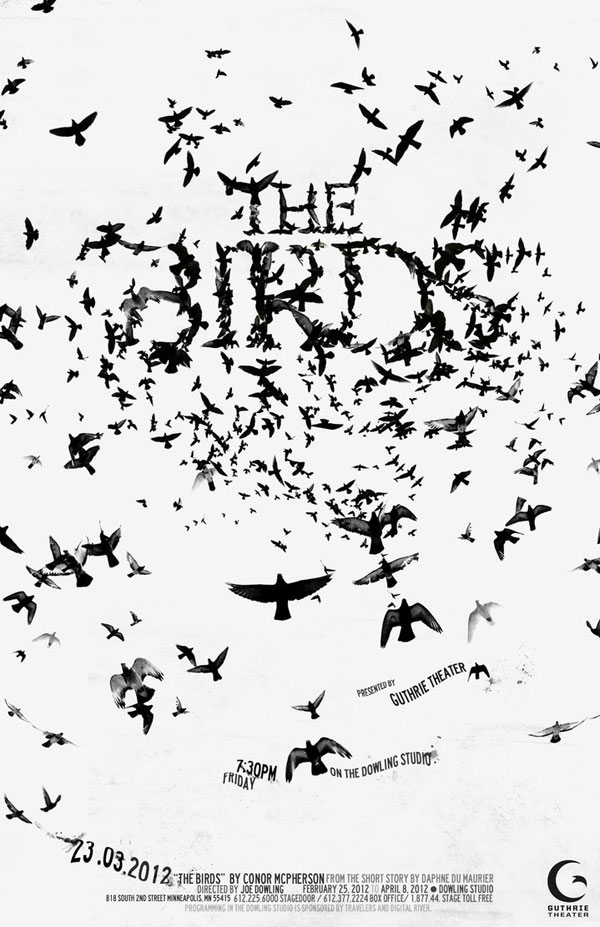
1. The birds
A beautiful take on a poster for the movie The Birds, made for a school project.
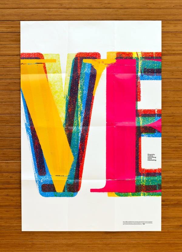
2. Diversity
One of the many excellent typogaphic posters made by Brian Gartside and Juan Carlos Pagan for the series “Diversity“.
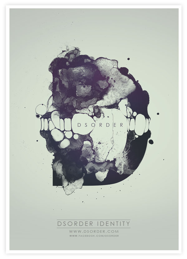
3. Dsorder
A poster made out of a gorgeous typographic identity for Dsorder.
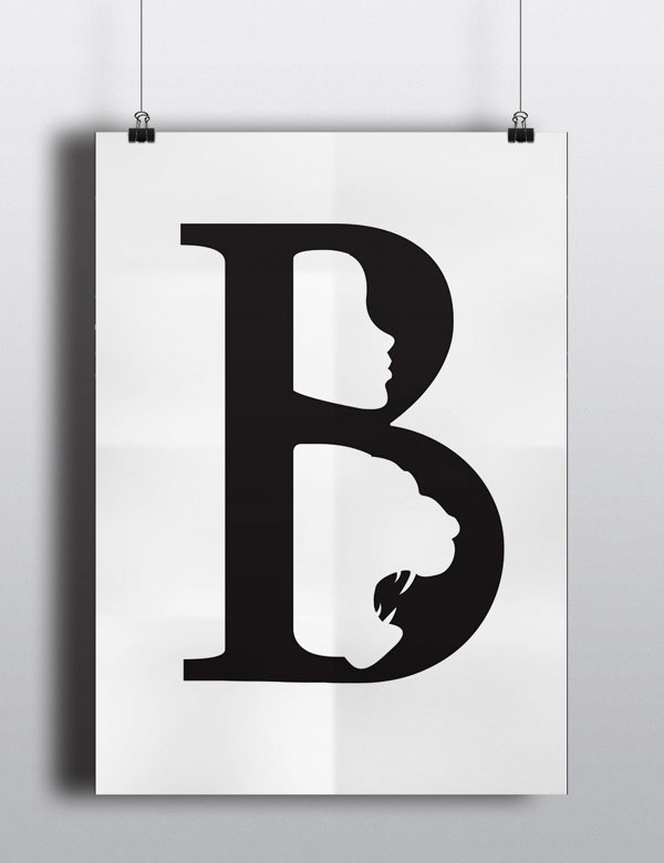
4. The Beauty and the Beast
A cool alphabet letter poster that combines both the beauty and the beast. Part of a series of posters made by Anwesha Daolagupu from India during an internship.
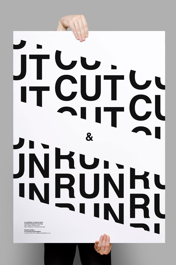
5. Cut & Run
Made during a workshop about typographic attributes, this poster makes perfect use of white space.
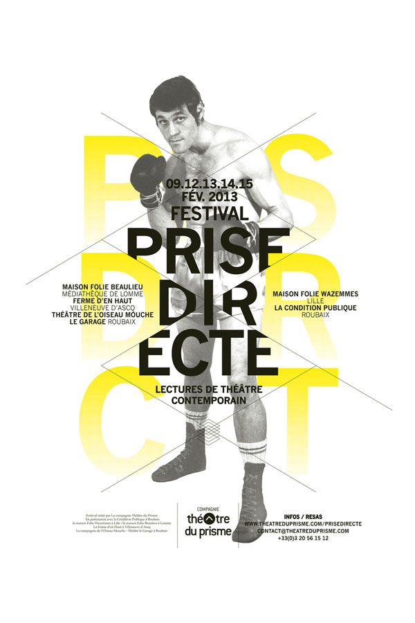
6. Prise directe
Nice use of typography on multiple levels in this poster created by Les Produits de L’épicerie.
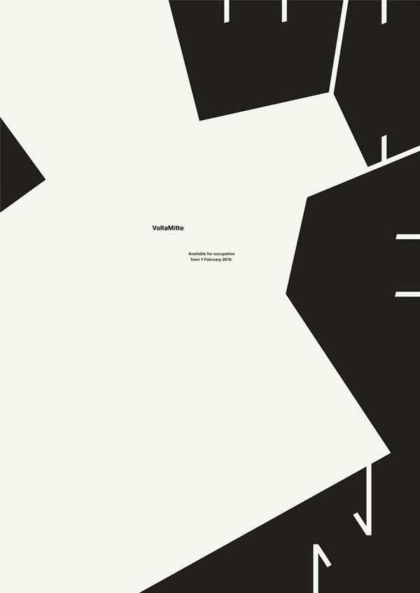
7. When
An experimental typographic poster designed by Kambiz Shafei, a talented Iranian designer based in Switzerland.
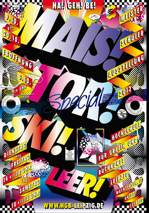
8. MAIS! TOR! SKI! LEER!
A spectacular and colorful poster by Lamm & Kirch.
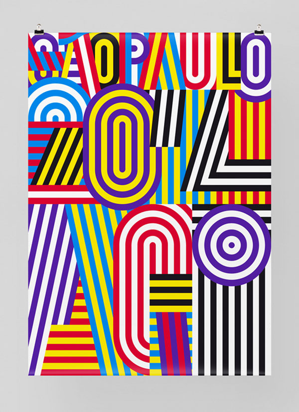
9. AGI 2014
Poster for the AGI Group Exhibition in Sao Paulo by Felix Pfäffli.
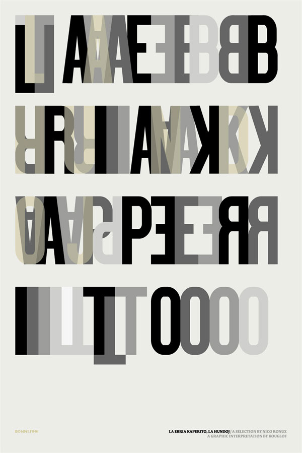
10. La Ebria Kaperito
A totally unreadable, but beautiful poster design by Kouglof.
