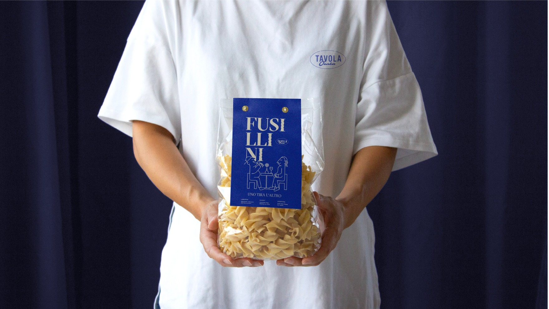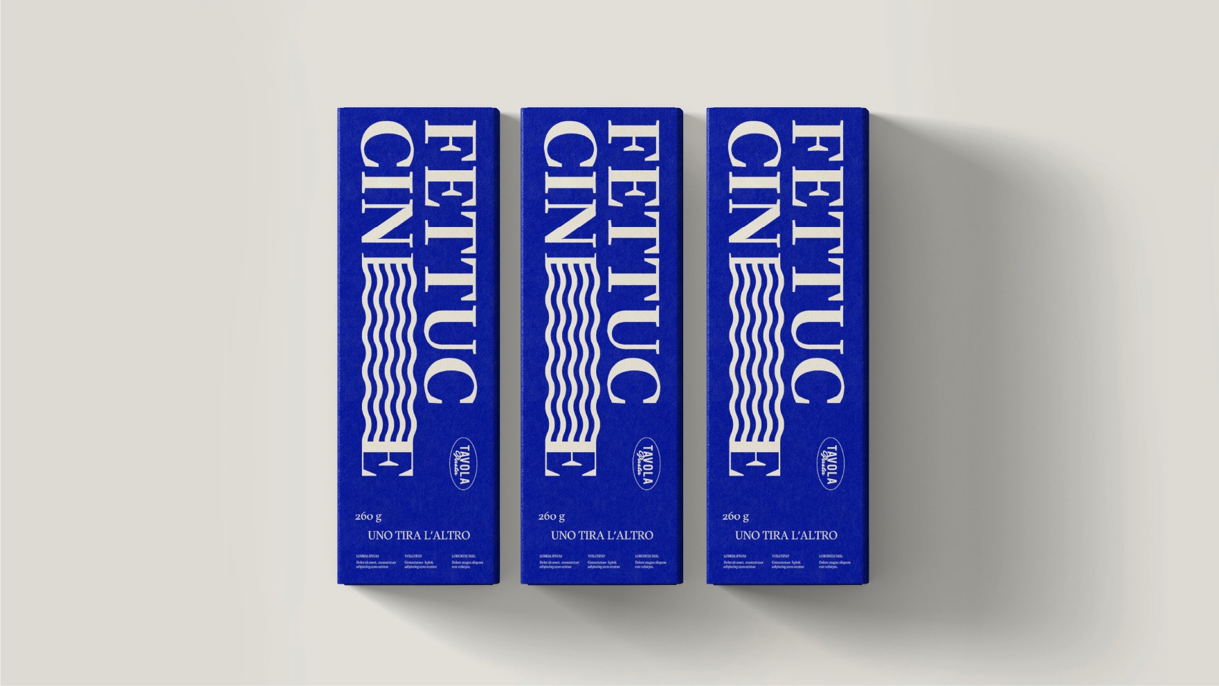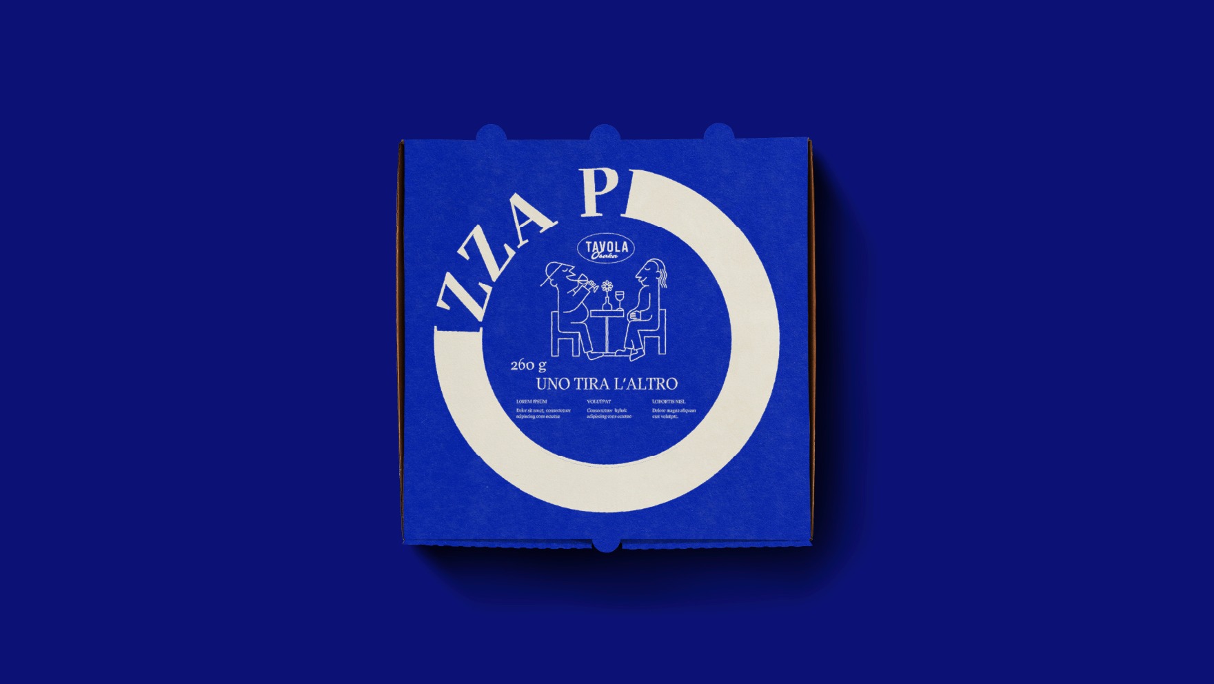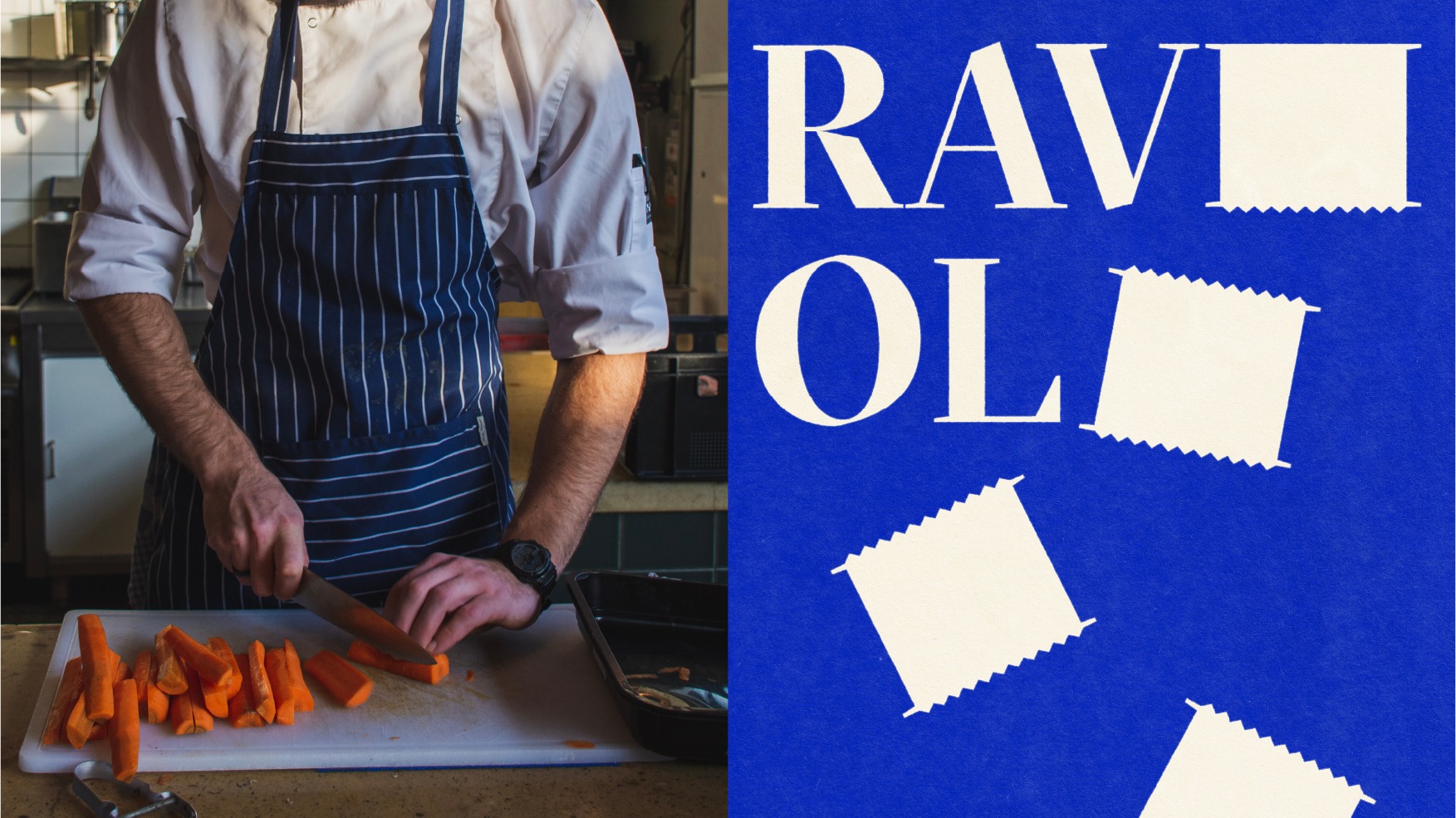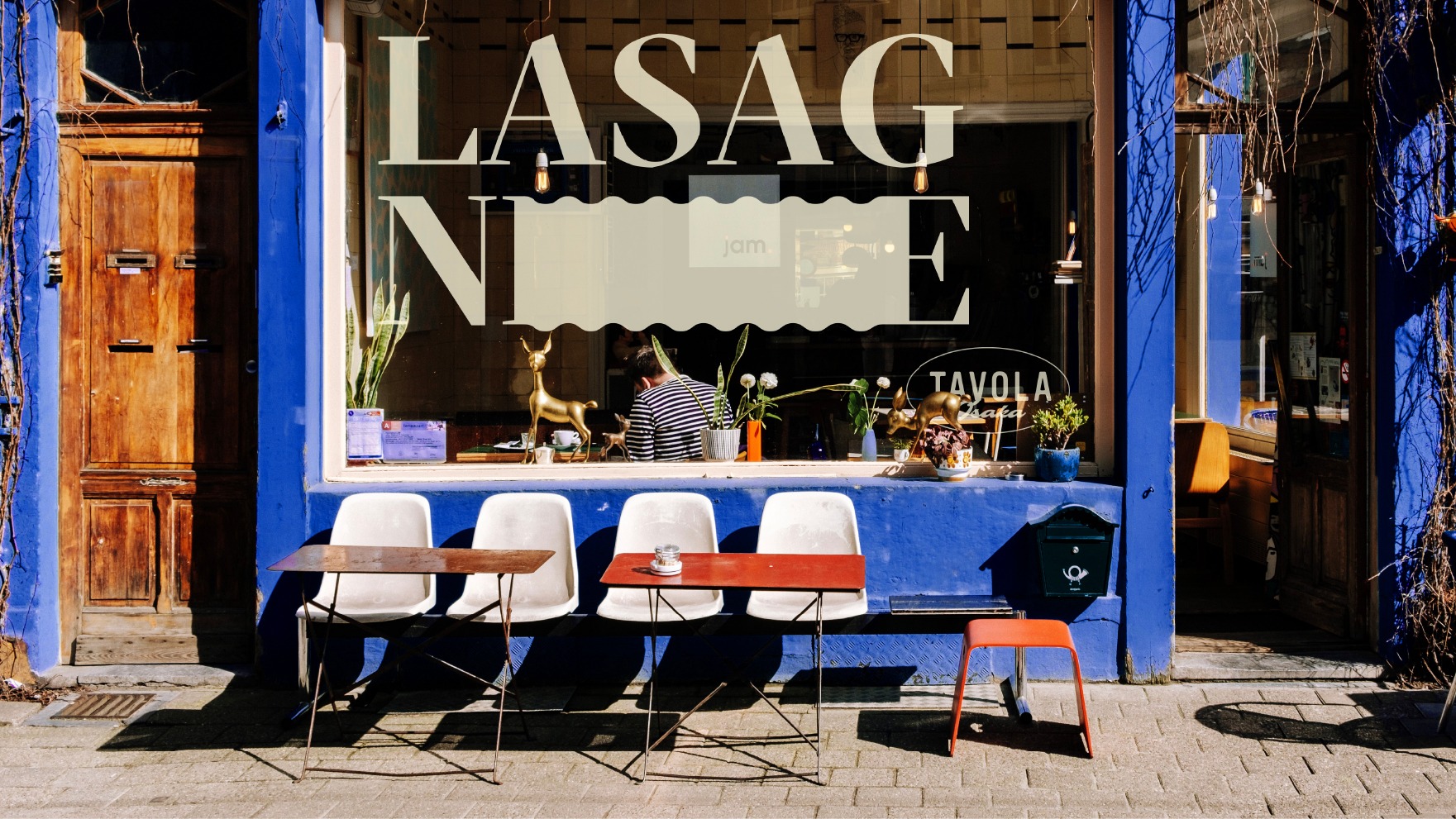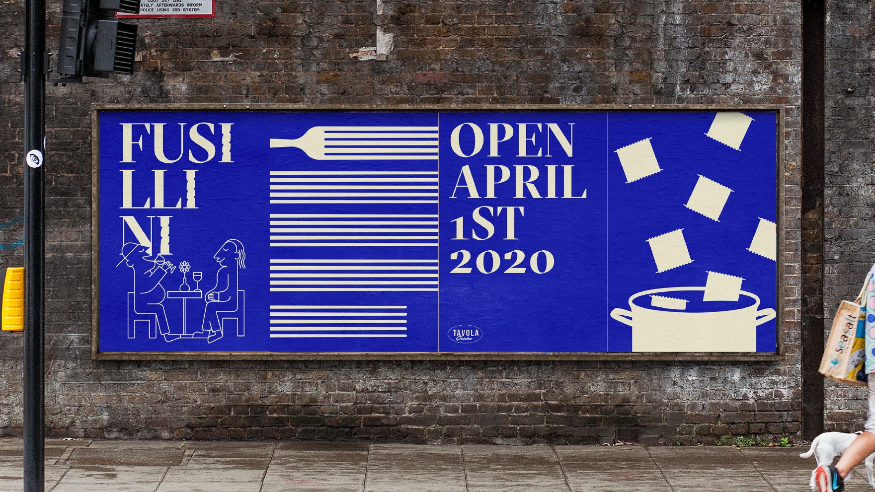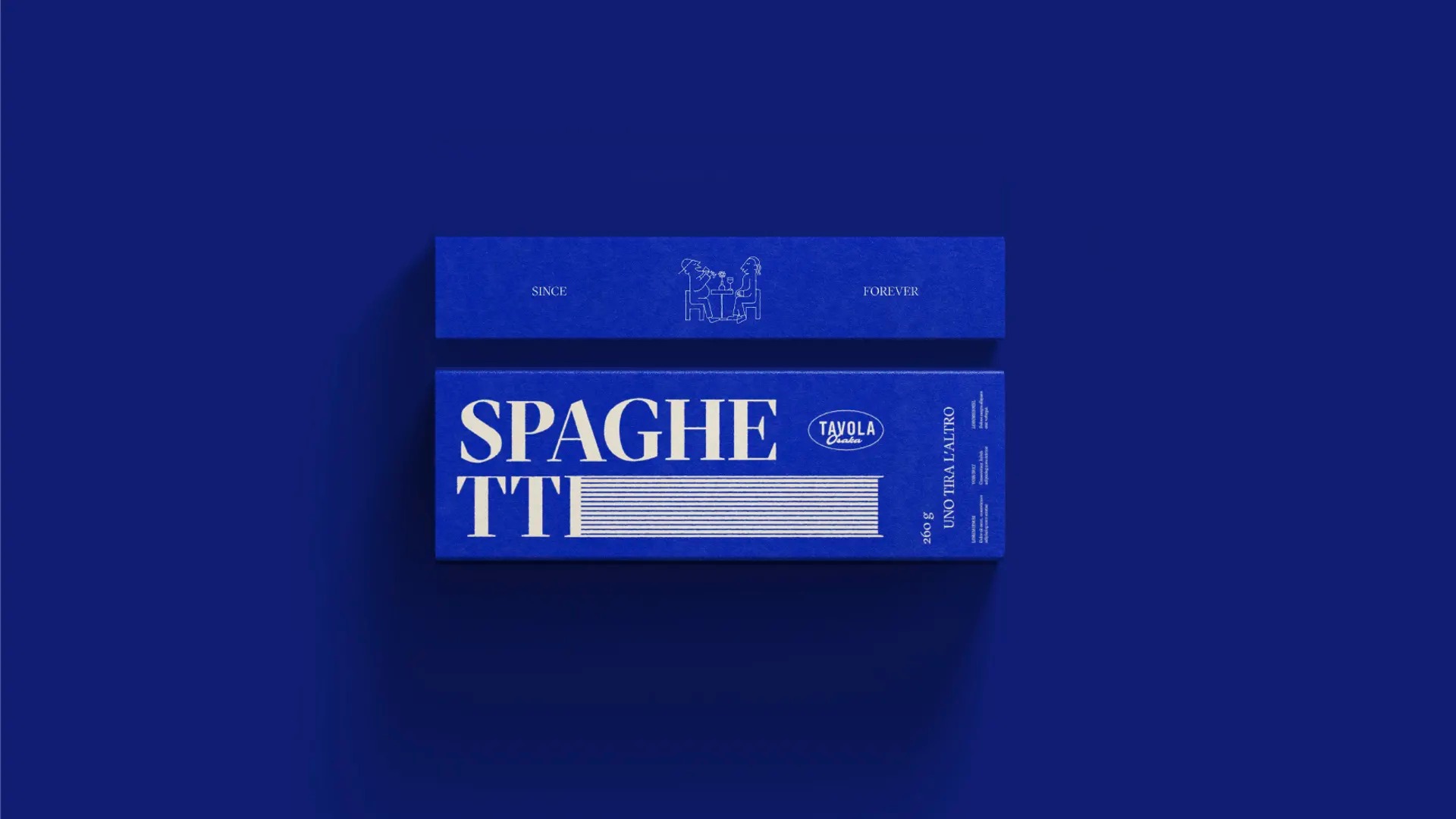
It’s not so often that you find some truly well designed packaging, so I was delighted to stumble upon this wonderful work done for Volta by Stamp.
Focused on typography and elements around it, the design uses lines, waves, and simple shapes to suggest the pasta rather than placing photos on it. The choice of colors and simplicity, along with simple line-based illustrations, are an amazing publicity for this Italian restaurant located in the heart of Osaka, Japan.
