Designers and developers have become so busy trying to adapt to the technical requirements of the internet that they have forgotten how to maximize the full potential of the medium. Using emotions to make web design work better has been mostly neglected, which is unfortunate given the power of emotional design in creating exceptional user experience. According to a blog post of Propelrr, a non-linear digital company, emotion is one of the vital considerations when creating or designing a project. We are designing for human beings, and we all have emotions. These emotions ignite or dictate our decisions on what we do every single day.

Emotions play a big part in creating effective websites. Photo by John Togasaki via Flickr, Creative Commons
An effective emotional design strategy allows designers to make something so unique that it transcends style and has the ability to produce positive response from users. Positive response or positive emotions from user experience design makes users want to connect or interact with your product or service, which is the primary aim of an effective digital marketing strategy. There’s no excuse for poor design but when users are served with positive situations, it makes them relaxed and when people are relaxed, they tend to overlook the minor problems that they may find in an interface.
Why Attractive Things Work Better
In order to understand the importance of using emotional design, one needs to know how “attractive things work better,” as stated by design critic Don Norman. In his book aptly titled “Emotional Design,” he explains the ability of attractive products to trigger one’s creativity and how it can make problem solving easier. To further back up his claims, he conducted a study and presented three levels of visual design that make a website both beautiful and functional. These levels are based on the way a human brain functions.

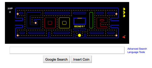
This generated so much excitement among Google users. Photo by dennis crowley via Flickr, Creative Commons
Level 1: Visceral
The first and most primal level draws from our instinct. Our perception of something is affected by personality and cultural values. Since it’s the first level, this has an immediate emotional impact on the user based on look, touch, and feel. An effective design at this level makes users feel happy and excited, which is a great first impression.
Level 2: Behavioral
This level dwells on the function and performance of something. A design should be usable and understandable in order to be effective. An interface that is easy to use triggers positive emotions from users. A designer should work into fulfilling a user’s needs by featuring relevant functions.
Level 3: Reflective
This is where our highest level of feelings, emotions, and cognition reside. This is the part in which a user makes use of extensive reasoning and can overrule emotional impact and automated behavior. This level of design draws from users an overall impression of a product.
All these levels should work together in order to come up with good and effective UX design. When these levels are satisfied by the designer, a website can look appealing, pleasurable, and memorable.
Implementing Emotions into Designs
Now that the levels of visual design are discussed, it’s time to get down to the business of incorporating this knowledge in website design development. A visual design should contain elements that can make it more personal for users. Aside from the primary elements like colors, shapes, and images, there are less obvious but equally important ones that should be included into the equation.
Factor 1: Humor
There’s nothing like a good laugh to make people feel relaxed and easier to connect with. However, a designer can’t generalize the concept of humor since it is different strokes for different folks, as they say. One thing can be extremely funny for one person but can come off as insulting to another. It’s important to know your target users well in order to get the usage of humor right. Even if you weren’t able to make everyone see the hilarity of something, what’s more important is that you don’t offend anyone or make them feel uncomfortable. Keep in mind that the kind of humor you use will rub off on how users will perceive your brand, your products, and your services.
Factor 2: Recognition
It’s human nature to seek approval and connection with other people. This is why we search for faces we can relate with and content that we can understand. When we recognize ourselves in a design, we begin to see the end product as more than just a screen filled with shapes, colors, and text. The design is humanized and we connect easily with something that is so much like ourselves. The more human the user experience design is, the easier one can relate to it.

We search for faces we can relate with. Photo from Avon.com
Factor 3: Dissonance
Another aspect of human nature that comes into play here is our penchance in finding patterns in the things that we see and do. By putting things into patterns, we understand things clearly and we make expectations clear, which in turn makes us comfortable. It’s natural for us to try to find patterns on the web in the same manner that we try to find patterns everywhere else. This is what usability rules were made for – they provide structure that users can recognize. This makes users feel comfortable and enable them to focus on the website’s content and message, which is actually the main goal of the design.
Factor 4: Tone of Voice
This emphasizes the manner in which you communicate with users. The tone of voice that you use to communicate with users reveals your opinion of them and what you want them to think of you. In order to use the correct tone of voice, you should know whom you’re selling and the context in which you want to have the message delivered.
Factor 5: Engagement
In order to build relationships and promote positive user experience, you need to do whatever it takes to engage users. This can be done by personalizing content in such a way that users will be entertained and have fun. Just like the other factors mentioned above, defining who your user is and their context is what you need to determine how you will engage.
Take interaction to another level.

