Did you know that the attention span of a human is shorter than a goldfish’s? The attention span of a goldfish is 9 seconds while a human’s attention span is anywhere from 6 seconds to 8 seconds! You’re probably wondering what this has to do with your website… well, it has a lot to with the design of your website.
You may find it hard to believe but the way your website “looks” plays a major role in how long a customer or visitor will stay on your site. Because a human’s attention span is shorter than that of a goldfish, it’s incredibly important to grab the visitor’s attention within the first few seconds of their encounter to your website.
You Have 7 Seconds…
Tributemedia.com says that when someone visits your website, your website needs to answer four questions within seven seconds:
- What is this website about?/How will it help someone?- Once a visitor lands on your website, they should be able to figure out what your website is all about or what product or service it is you’re selling.
- Does this website grab their attention?- Aesthetically speaking, does my website look good? Your website should be easy on the eye, meaning easy to read with good font and size choices as well as a pleasing color scheme.
- What does this website want the customer to do?- Your website should have a very clear call-to-action. When a visitor goes to your website, it should be obvious what the website wants you to do. Your website should either want you to buy something or provide good and helpful information.
- Will your visitors have a good experience where they want to share it?- Hopefully so. You ultimately want anyone who visits your site to have a great user experience whether they’re buying something or not. You want them to leave good customer reviews and share your site with friends and family via word-of-mouth or through social media.
Design Elements to Make Visitors Stay and Gander
Let’s say that you have an online business and you have all the logistics worked out but you’re still trying to find the best small business WordPress hosting. With that, you have several wonderful options to choose from that can take your online business to the next level. Once you find the one you want, this is when the creative process of building your website comes into play.
Typography: It Should Be Unique and Distinct
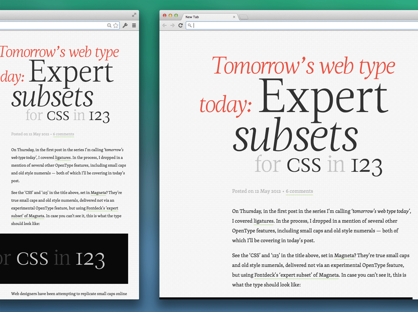
For your website, you’ll want typography or a font that will be uniquely linked to your site… something that visitors will be able to distinguish in their minds that will make you stand out from your competitors.

Large Images of the Product
For your business, if you’re selling products, you want to make sure that you have large images of your products so that visitors will be able to see what they’re truly buying. These large images help potential customers see the product in great detail.
For these images, you don’t have to be a professional photographer either… but you do need to know how to use photography effectively. The large images you put on your site should entice visitors to want to buy whatever they’re looking for on your site.
Organized Menu
Nothing is more unattractive on a website than clutter. Clutter isn’t just found in homes… websites have clutter too! Because of “website clutter” a lot of businesses opt for the “hamburger menu.” With the hamburger menu, it allows visitors who visit your site to be able to go to the exact page they want to see. It’s those three lines stacked on top of each other (like a hamburger) that you see on the top right-hand side of a website.
Videos in the Background
One thing that people don’t take advantage of or realize the benefit of is background videos. Having a video that plays in the background of your website can actually save a lot of space and reduce a portion of content that could be needed to explain the purpose of your business.
For example, a visitor may come to the homepage of your site. Upon arriving on the homepage, a large video automatically starts playing. Once that video starts playing, it will then prompt the visitor to want to click the main video. The purpose of the video is to entice visitors from the moment that come to your site. This is especially important, given the human’s short attention span!

