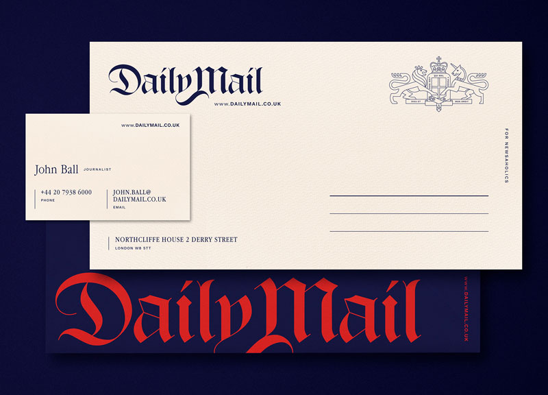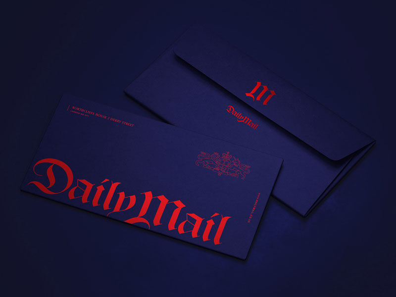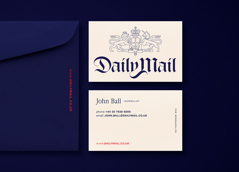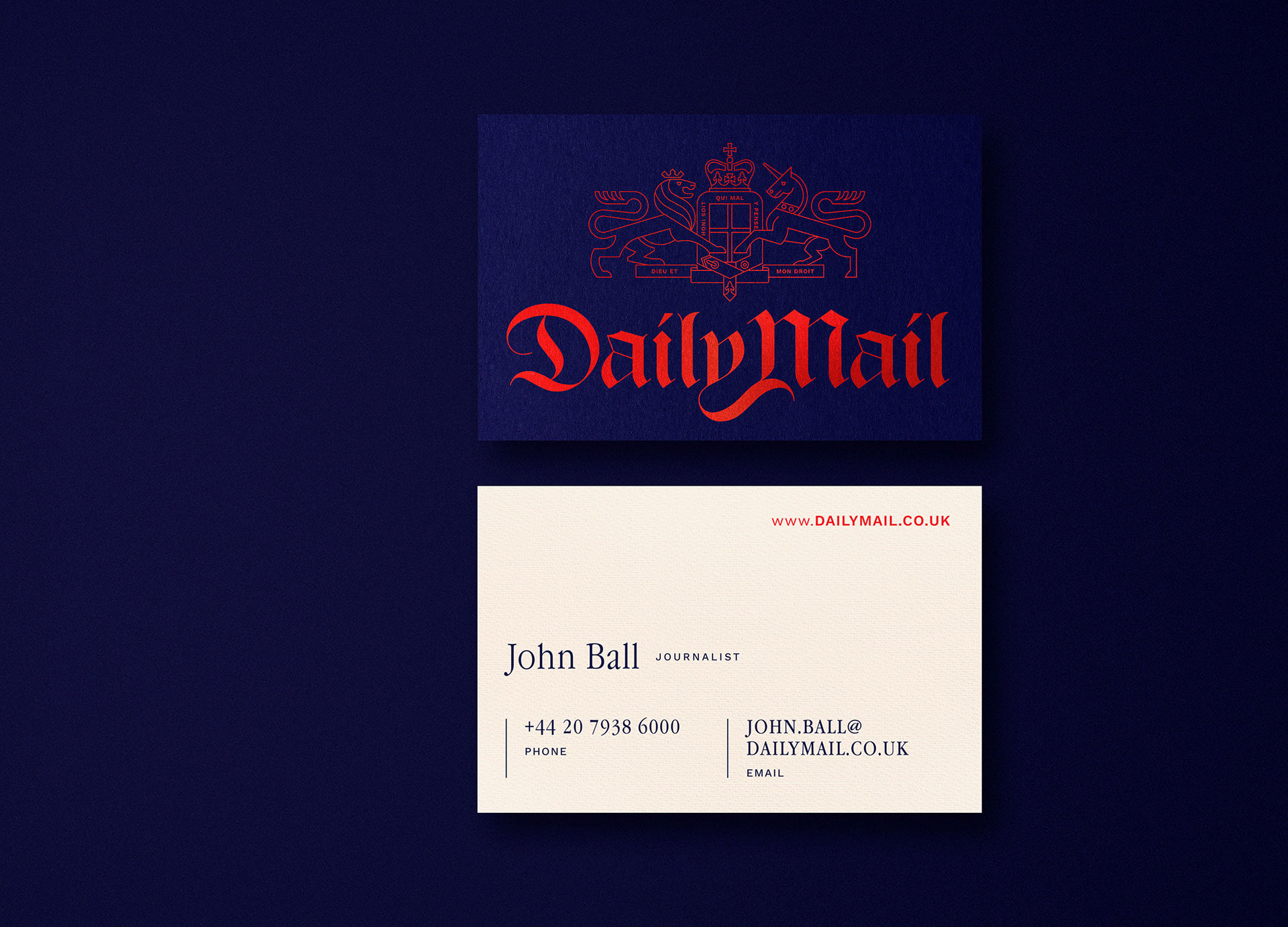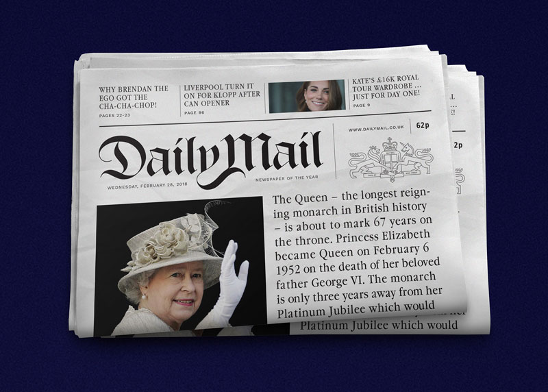
For English-speaking news readers, the name “Daily Mail” is synonymous with “low-quality news”. What once was a decent conservative newspaper has become the epitome of a tabloid.
If you want to understand why, just take a look for yourself.
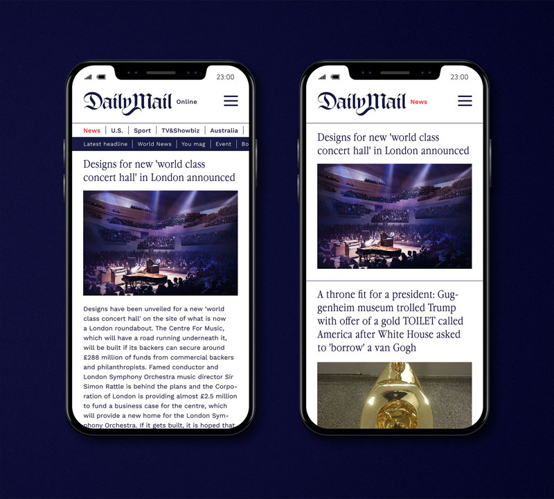
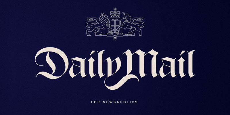
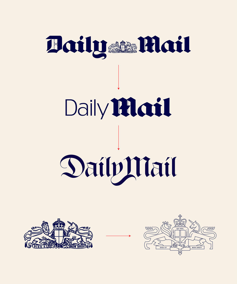
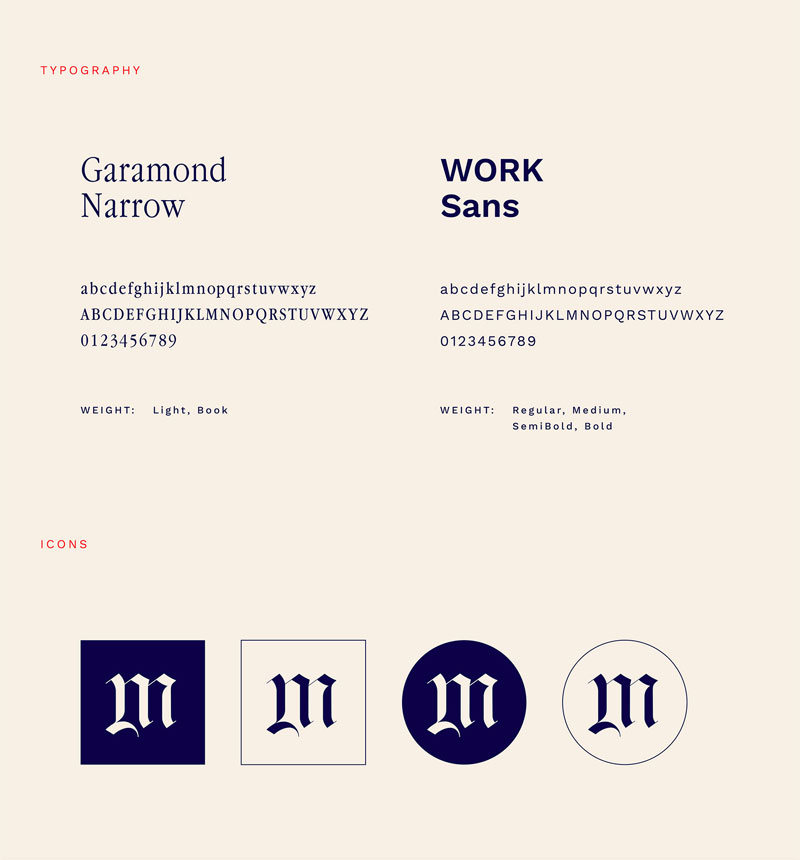
Acknowledging this, Hungarian design Miklós Kiss wanted to try a little experiment: what if the Daily Mail was published with an elegant branding and layout? In this post, you can see branding concepts produced by him. You can see all the designs on this Behance page.
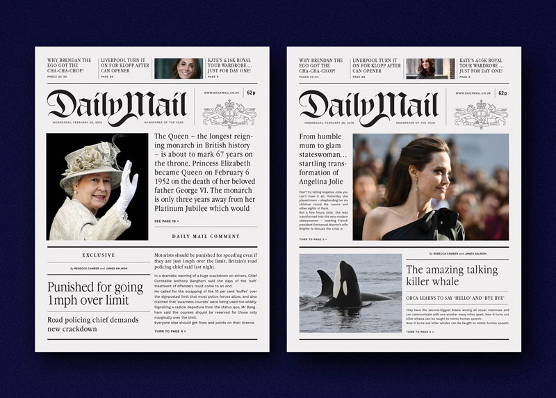
If you are a designer, you will not be surprised by these results. After all, most branding is done to please a certain group of people. Kiss’ designs are very pleasing for the eye, but could they reach the right type of audience and help the newspaper to sell more? This is far from likely, in my opinion.
To make this experience truly meaningful, it would be interesting to print some copies of a Daily Mail edition using the Hungarian designer’s concept layout and branding, then measure the performances and see if the audience changes.

