Are one-page websites effective? Due to their lack of complexity, one-page websites are often dismissed by designers. However, they can often provide an effective solution to many.
This article aims to explore when a single paged website would be helpful, and how to go about constructing one…
When would a single page website be helpful?
If you’re wondering whether to build a single page site, have a look at your content. Is your content limited to a single topic? Do you have only a few chunks of information which can be placed on a single page?
Diluting your content simply so that it will fit on a single page is not always a great solution. If you have a great deal of content, in different topics, and if this content could span multiple pages, then a single page website may not be for you.
If your content is short and to the point, a single page site would be helpful. Single page sites are also very useful if content flows into a single narrative or story which would suit a single page.
If you’re starting out small and only wish to share a small amount of information, a single page site would suit you. You can always build or add onto your site later on.
Single sites are also a great opportunity for people who need a website to be online while a fuller site is being developed.
A single page site is a great addition to social media profiles such as a Facebook page or Instagram account, and these accounts are providing great traffic to your site.
You are not using content or SEO to attract visitors or new clients.
What about SEO strategies?
SEO uses content to attract visitors to your site. Search engines rank sites with particular keywords as more valuable. As a result, many websites use SEO techniques such as keywords or questions in order to achieve a higher ranking with Google.
A single page site doesn’t have a high amount of content. This means there is not a great deal of information to offer search engines and the site might not rank as highly. However, using a single page site doesn’t mean you won’t be able to use some SEO principles.
You can still ask questions which apply to your services or product and use keywords in your copy. These basic SEO principles and techniques will still assist you while setting up your site.
What about parallax scrolling?
Parallax scrolling is a website technique which shows the foreground of the site moving more rapidly than the background, as a user scrolls down the site. This technique helps to create a 3D effect.
Many designers prefer not to use parallax scrolling in site design, believing that although attractive, it does not improve the user experience.
Sometimes the arguments about whether to create a one-page site and whether to use parallax scrolling have combined, and designers speak out about one-page sites because they dislike parallax scrolling.
Parallax scrolling does not have to be a part of a one-page website though.
When should you consider creating a one-page site?
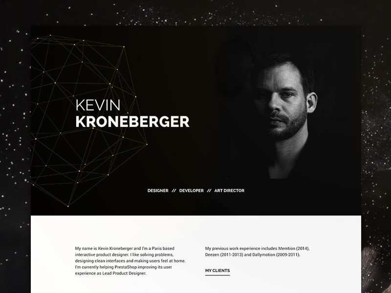
If your site has information that could be condensed into a single page, with contact details placed at the top or bottom of the site, a single page might be ideal. This may give coherence to your content while keeping your site fresh and modern.
When content is sparse, a single page site can make your content seem more complete.
If your site would be very simple and efficient to use as a single page, it is worth making use of this design. This will keep your site easy to use for viewers while presenting everything you need to share.
Add navigation links to your site
Your viewers may be able to access all of your content by simply scrolling, but it wouldn’t harm your site to add extra navigation links. If you have a long page, adding navigation links to the various sections or elements of your site will keep it easy to read.
Try to add these on the top of your page, near your logo design. Your users need to find these links easily.
Use headings and subheadings to divide up your content
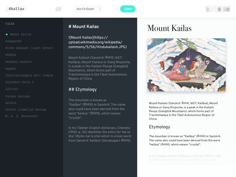
Large masses of content can feel difficult for your reader. Internet users prefer to take in information at a glance. By using headings and subheadings, your reader will be able to grasp the contents of your site quickly.
Subheadings allow your reader to choose what to read and the sections which appear most interesting.
Make use of imagery
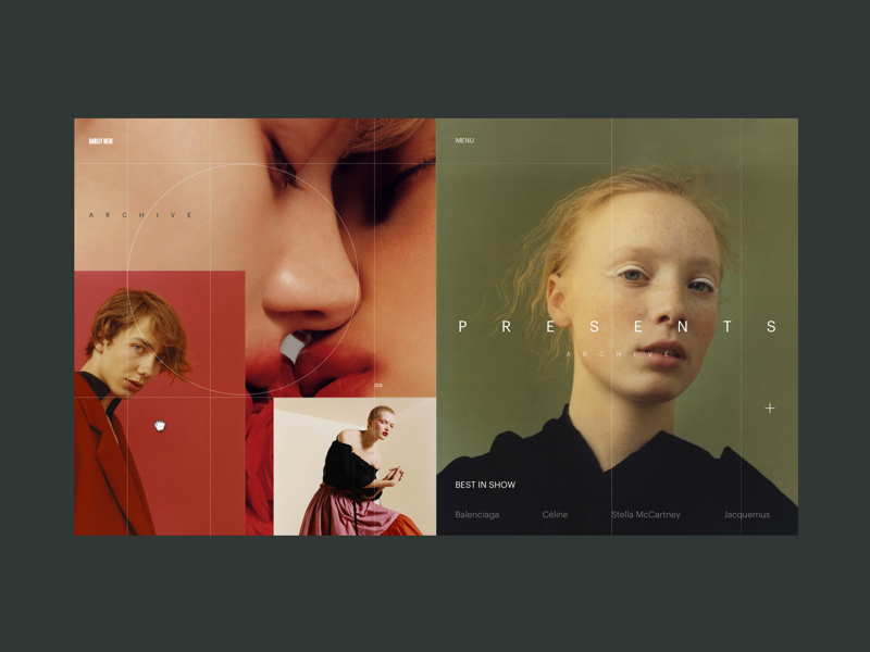
A single site will often have a large amount of white space. If you’re only using a single page for your website, emotionally resonant and relevant imagery will add interest to your page.
They will also assist you to divide up your content. Effective imagery will, therefore, assist you to add appeal to your site.
Create a hierarchy
Internet users like their information to be concise and easy to read. When creating a site, your headings will help your reader to understand your content. You will also want to structure your site so that your reader is most likely to read important content first.
When constructing your site, keep your most important information at the top of your page. Interested readers can scroll down and read more if they want to.
Use multimedia to add impact
Although many site holders will tell you that content is king, we also know that pictures speak a thousand words. Over 65% of people are visual learners. This is why illustrations, photographs or images are a very effective way to share a message.
Images produce an emotional resonance in viewers, and they will break up your text, helping you to hold your viewer’s interest. Images are able to give a message clearly without demanding an awful lot of your viewers.
You can use photos, videos or slideshows on your site.
Images: create visual impact. If you are creating a one-page website, adding images which resonate with your viewer will enhance your site. Keep your images relevant, high quality and eye-catching.
An emotionally resonant image will assist your viewer to identify with your brand and keep viewers on your site. If you take high quality, professional looking photos, you can use these to communicate with your viewers. Alternatively, there is a range of royalty-free stock images available for use.
Look for stock images which are uncommon in order to make the greatest impact on viewers.
Slideshows: Photos or illustrations can be combined in the form of a slideshow, which can be used to tell a visual story. Slideshows can often share complex messages with ease.
Videos: site viewers deeply appreciate videos. These videos can be used to share messages which keep viewers engaged. Videos make a great feature, keeping viewers engaged.
In fact, research shows that viewers spend 100% more time on websites which offer videos as a part of their content.
Keep your calls to action clear and visible
Your call to action is a clear message to guide your viewer into taking action. Without a clear call to action, your visitors will not know where to go or what to do next. This is as true with single page sites as it is with complex and intricate ones.
In order for your call to action to be effective, it needs to be persuasive. This may mean receiving a free offer or coupon when you subscribe to a site or knowing exactly how to place a purchase in your shopping cart.
Keep your call to action clearly visible, use colour to help it to stand out from the rest of your site, and make sure that it is not surrounded by too much information.
When you half close your eyes, your call to action should be the first thing you can see on your site.
Summary
Although websites are often appreciated for their intricacy and ability to convey information, a single page site can be equally effective. Although single page sites may hold less content, they make an excellent choice for many businesses.
Weigh up the value of creating a single page site for your business. It may just be the option you need to get your message across.

