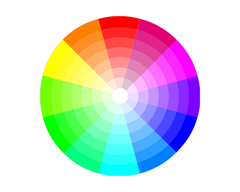
Color is one of the most powerful means of communication. Nature uses it to signal us what is dangerous or poisonous, to attract or repel. Each color has its meaning and a special place in our everyday lives. We are used to associating pink with girls, blue with boys and red with a passion but how does the game of colors work in a business setting?
The basic meaning behind the game of colors
The emotion that colors evoke has remained strong throughout the years.

The Color Wheel gives us a definition of the meaning of each color, which can be very useful when you are choosing the main nuance of your brand.
- Red is an emotionally intense color and is used to make people take quick decisions. It is associated with energy, power, strength, desire, and Red is used to emphasize a given text or image and it brings them to the foreground. It is part of many national flags and important road signs such as “stop”.
- Orange is associated with happiness, enthusiasm, creativity, and It stimulates mental activity and is associated with citrus fruits and hence with healthy food. The color is often used to promote toys or food.
- Yellow is a warm, cheerful color that brings happiness, joy, energy and is associated with intellect. As it grabs the attention, it is a good idea to use yellow for the most important elements of your design. You can use it to promote leisure activities, for example.
- Green is the color of nature and is highly associated with safety, harmony, growth. You can use it to promote “green” products and safe medical products. Darker green is the color of money so it is very good for a brand associated with finance, banking or Wall Street.
- Blue symbolizes stability, trust, intelligence and evokes confidence. It is a masculine color and is often used to promote high-tech products.
- Purple is the symbol of royalty, wisdom, magic. Most of the pre-adolescent children prefer this nuance so it is a good strategy to include it in your brand design if this is your target group.
- White is often seen as the color of perfection and symbolizes light, purity, goodness. It is often associated with the successful beginning and simplicity. It can be used to advertise safe medical procedures and hospitals or new technologies. It is also a good color for a charity organization.
- Black evokes power and is associated with elegance, power, and Black can be used as a background to make other colors stand out. It is often used for quite expensive products so including this color in your brand will make it stand out.
How color defines your brand
Color defines the feeling that we get towards a certain object no matter if it is part of the nature that surrounds us or is an artificial discovery of mankind. The same associations arise between a given color and a brand. When you think of Coca-Cola, for example, you definitely see red. Ferrari is yet another brand that makes use of this powerful color.
A combination of red and yellow is often used by fast food chains. Recently, McDonald’s decided to run away a bit from this combination by adding some green to its main colors as a symbol of their attempt to distinguish themselves from their competitors.
Handmadewritings who specialize in providing custom writing services use a lot of yellow in their brand design, which as mentioned above is the symbol of intellect and thus they emphasize the intellectual services they provide. The combination of old-fashioned books and a blackboard enhances the meaning of the brand and their position in the educational market.
Many banks use green, as the symbol of money or the national colors in order to win the trust of their customers. Newspapers and magazines that are established as a solid and trustworthy source of information prefer black in their design as a symbol of their high quality.
The overall idea is that you should know your customers and the message you want to send them when choosing the colors of your brand.
The power of color
There are many studies that reveal the significant role color plays in building a relationship between a potential customer and a given brand. A person needs just 90 seconds to make their decision about another person or a product and the influence of color in this process is between 62% and 90%. This means that you should not underestimate the power of color when designing your website, logo or any other materials related to your brand. Take time to research the market, learn from your competitors and find inspiration in nature in order to come up with the best color combination that will establish your brand on the market.
Color is emotion and we often choose our favorite brands with our heart but through our eyes. When it comes to design, it is good to consult experienced experts in the field who can give you the best tips when it comes to nuances. Keep in mind the above-written advice as well and you will manage to find the best shade for your brand and play the game of colors with confidence.

