It seems at first glance that fashion and web design might have very little in common. After all, one is a dimensional art, made with any number of materials, while the other is flat and composed only of pixels. However, the two disciplines have several striking similarities; for example, both need to follow certain set guidelines in order to be workable; both prize functionality just as much as they do form.
There are also a lot of similarities in how fashion and web design ideas tend to disseminate. In both, there are cutting-edge designers who strive to pioneer new trends and push the industry forward with their work. The work of these trendsetters trickles down to other designers who respond to their work, adapting it in different ways and for different audiences. With this fundamental commonality, it makes a lot of sense that fashion and web design should borrow from each other, using concepts that were pioneered in one to strengthen and enrich the other. In effect, borrowing between design fields is just taking design propagation just one step further.
With all the similarities in the goals and viewpoints of web and fashion designers, it comes as no surprise that some of the most beautiful and functional sites to be seen on the web are fashion retailers, many of which display fashion and web design trends in equal measure.
Web Design Trends Brought into Fashion Websites
New styles are usually derived unevenly and from diverse sources, making it difficult to track all the way back to their root. So while it’s difficult to absolutely pinpoint one industry as being the first to make new uses of a motif, it’s easier to show a progression of that motif from one area of design to the other. Some motifs that began with graphic and web design and later influenced fashion designers include:
Dimensional Photography
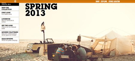
If there’s any kind of designer who knows more about adding a sense of depth to a flat surface, it’s a web designer. Websites used every trick in the book to give pixels on a screen the look of almost any other surface or texture, using overlays, drop shadows, and every other trick of the trade. But designers have always found that one of the most successful and simple ways to do this is by displaying a beautiful full-page photo, seen in this site above, that creates the illusion of depth by the simplest method of all.
Fashion took its cue, and many retailers have lately been bringing out trompe l’oeil effect prints that boast the same all-over photographic effect, showing every scene imaginable, as long as it might momentarily trick the eye. Both in fashion and on the web, this trend serves as a way to pull the viewer in, and momentarily capture their imagination as well as their attention.
Typographic Statements
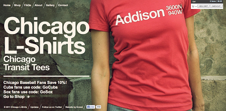
While typography has long been a part of most kinds of design, its newest incarnation—the sleek sans-serif declaration, picture on this site above—was appropriated from the world of web design, and has been emblazoned on clothing with every motto imaginable. Strikingly large title type demands attention both on a webpage and across a sweatshirt, and the white space or contrastingly smaller type surrounding it ensures that the message sticks.
Fashion Design Trends Brought into the Web
Fashion changes on a faster cycle than the web; every season yields a handful of new looks that will soon be spread out into all sorts of media. So it makes sense that, more often than not, it’s the clothing that influences the webpages. A few fashion trends that quickly passed over into web design include:
Color Blocking
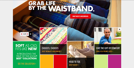
Amazon’s fashion client Fruit of the Loom is a perfect example of how this popular trend in fashion has made its way onscreen. Bright blocks of color are an eye-catching element that, while merely a fun aesthetic in the fashion world, serves a duel purpose in the world of web design. Sometimes color blocks help the viewer to identify sections on page, thereby navigating with greater ease. At other times they can be used to create a sense of movement, or to help ground the page by contrasting these simple elements with more dimensional illustrations or typography.
Neons
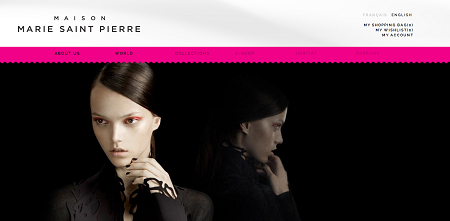
When neon started making a splash in fashion, it wasn’t long before every other type of design took up the torch. Neons work just as beautifully online as they do in person, and they look particularly striking when paired with another perennial fashion favorite: black and white. The bold neon pink stripe that serves to identify the navigational elements on this site is a great example of how this trend can be adapted in an elegant manner, in contrast to its usual youthful and edgy vibe.
Geometric Shapes
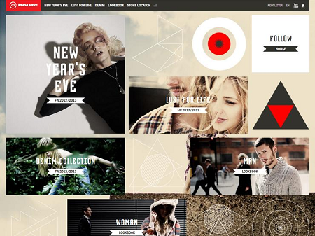
Another trend that first cropped up in the fashion world was decoration in geometric shapes of all kinds, especially triangles, chevrons, diamonds and circles. Especially in prints and in jewelry, these simple shapes make a graphic statement that is akin to the typographic statements previously discussed. And with their universal appeal, it was only a matter of time before these motifs started cropping up in web designs.
These illustrative elements add texture and interest, working especially well when layered in with other elements like transparent planes of color or photographic images. The unfussy, clean lines add a fresh and modern feel to any design.
Fashion design is often referred to as “cyclical” (although it would be better described as a spiral), because it’s constantly taking motifs from past styles and reworking them in new ways for a different generation. Because web design is so much newer a field than fashion, it remains to be seen whether it will follow this pattern, or ever become as influential in other industries as fashion has always been to other disciplines. But with their interchange already yielding such successful results, it seems that fashion and web design will continue to draw from each other for inspiration for a long time yet.
“Rob Toledo is a design and marketing nut who lives in Seattle, WA. He loves to chat about all things creative, so feel free to reach out on Twitter @stentontoledo or at chessclubcreative.com“

