If this is the first time you hear about a parallax-scrolling website, then you should check this article. Web-users need more and more a dynamic experience that offers a good content layout. One of the best solutions for this is to use a parallax scrolling effect.
Websites that have this effect increase their chances of getting more engagement and get the chance to tell their story. The effect has gained a lot of popularity on websites, and there are more and more that go for it.
What is a parallax scrolling website?

Parallax scrolling is a special type of scrolling technique where the background images move slower compared to the foreground images. This creates a sense of depth for any website. So it’s not complicated, especially when there are JS plugins you can use to get there. The motion is simple but brings a dynamic vibe.
The process of creating a parallax means that different layers of images need to be created at different speeds, especially when they are scrolled in a browser. The programmers can also design parts of an image that move in a particular order to bring more diversity.
Why has it grown in popularity?
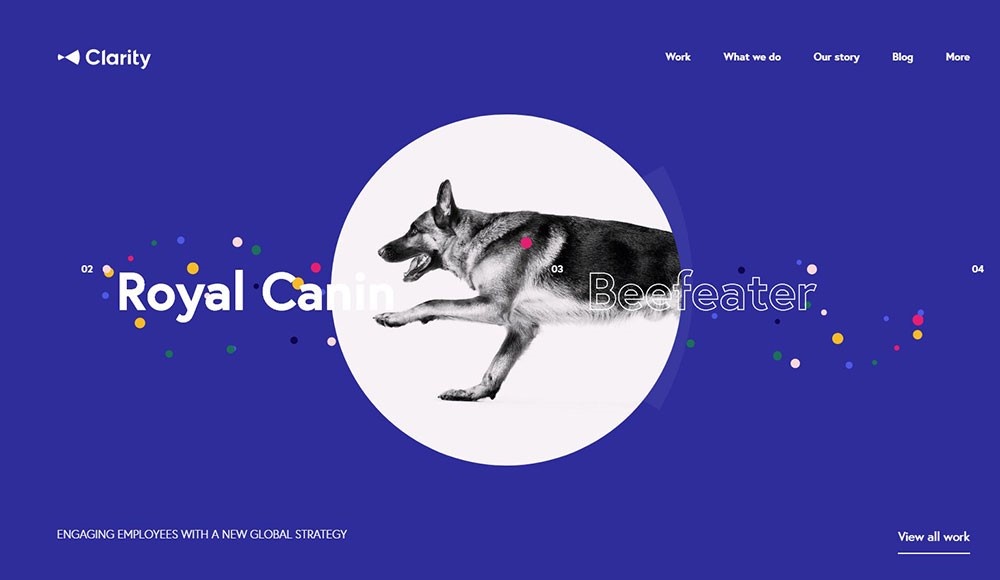
One of the first websites that were done using this effect was the well-known brand Nike. They launched a website that was focused on athletes worldwide, and it got a lot of good feedbacks due to its parallax scrolling techniques. Besides that, another important thing is that you don’t need to be an expert to use it. Today Parallax is a widely-used design on websites.
What are the benefits of having a Parallax scrolling website?
A Practical Approach
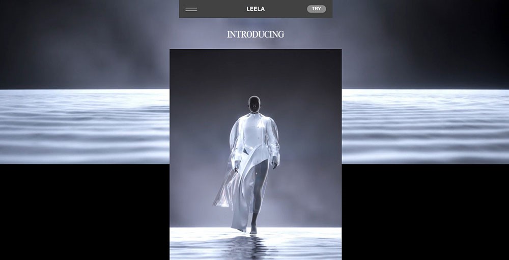
When a new user comes to a website, they need to understand what the site is all about. Most of the time, they need to go through different pages, and this might not be the best way of exploring. Parallax sites let developers put the content in one place.
The secret behind making it look good is to also have a story, some structure, so people understand the subject.
The scrolling lets users move at their own pace. Even if a website has a lot of information, this doesn’t mean things are going to get overwhelming.
Increases Engagement
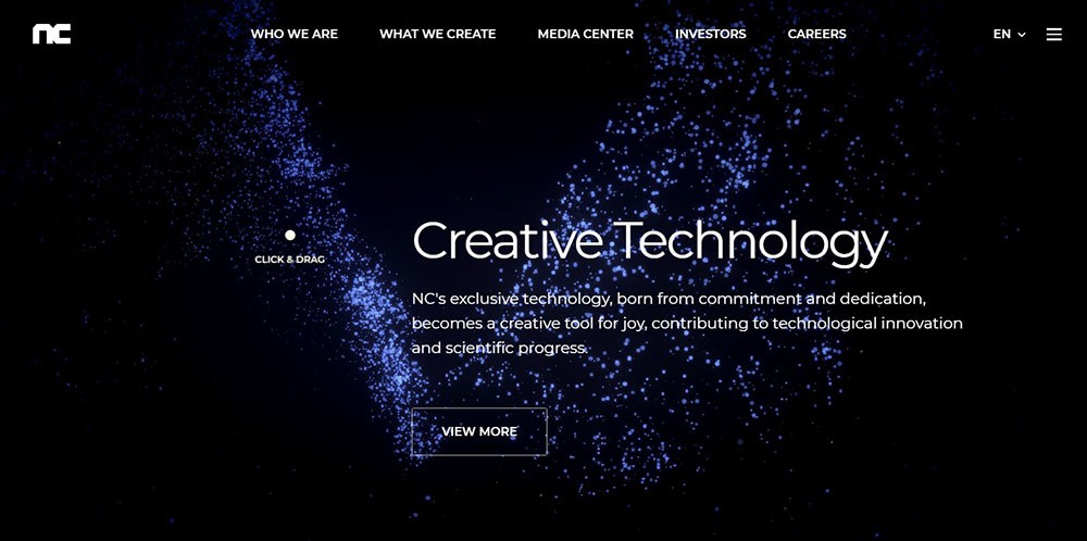
A Parallax scrolling website is going to engage users from the first second they enter. When they open the website, they feel that they are traveling through time as users scroll from one page to another.
This only encourages them to stay for a longer period of time, and this is harder and harder to do in a world full of captivating content.
Presentation
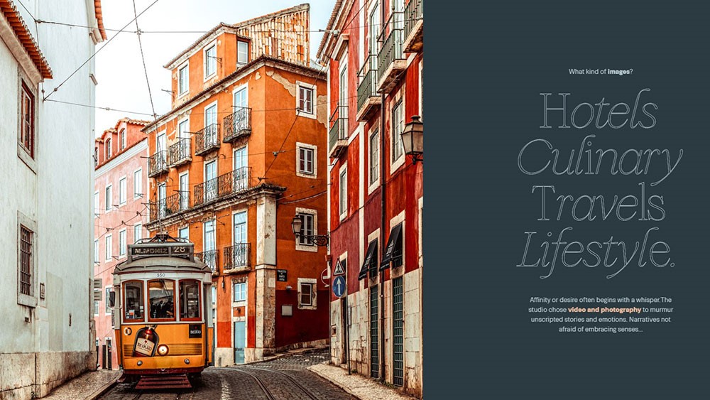
It’s a cool way of presenting products. Usually, brands go for static web content, but with this effect, people can explore products at their own initiative. It can be a real game-changer for your company.
Even if you’re fixated on using a dark color scheme, the parallax effect can turn your presentation to eleven. However, if you’re using a pastel color scheme would look even better.
Keeps the size small

Parallax websites have most of the information going on a single page. So you avoid having multiple ones, so there is no complicated navigation. People don’t have to jump to different sections of the site in order to see what they were looking for.
As more and more users are going mobile-only long-scrolling is one of the best options for them.
Tell a story
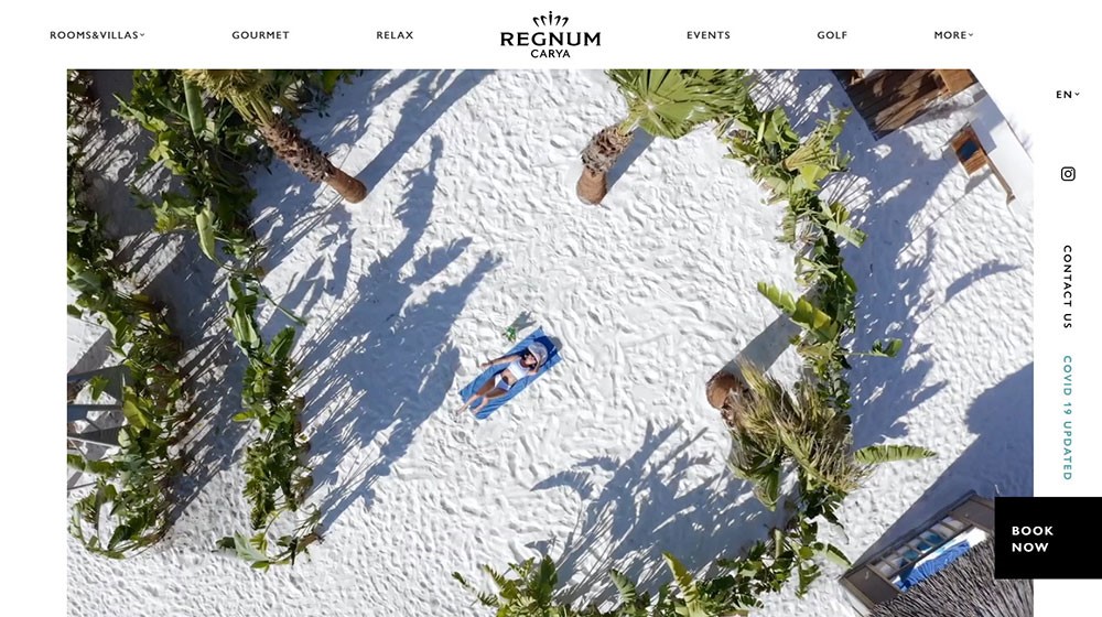
Parallax scrolling gives the ideal frame to tell a story. It does this engagingly and interactively, letting visitors take control and go through the story at their own pace. The layers that have a different response to scrolling offers visitors a sense of depth and makes room for multiple storylines.
Increases curiosity
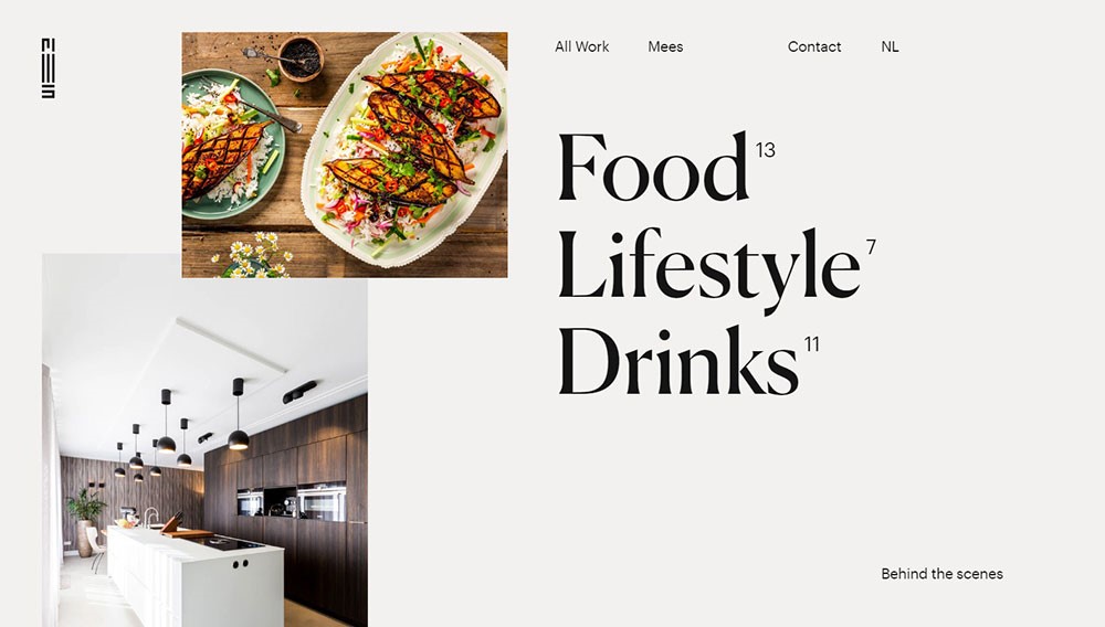
One of the best things about a parallax scrolling website is that it makes every visitor think about what is coming next. The element of surprise is present all the time on such websites. This is done by using awesome graphics or simple text that keeps people on a hook.
Some WordPress themes use this by default in their pages. For a client and its visitors who aren’t necessarily used to this effect, it looks like it’s out of this world and makes them intrigued about the subject.
Trigger

One of the most important aspects of parallax scrolling is that you get instant feedback when interacting with the site. This makes us more alert and ready to go on because, after each scroll, something different happens.
This depends from website to website and how they were built. Still, a good concept is going to make people want to stay more and keep exploring all the content on a particular site.
Generate Backlinks
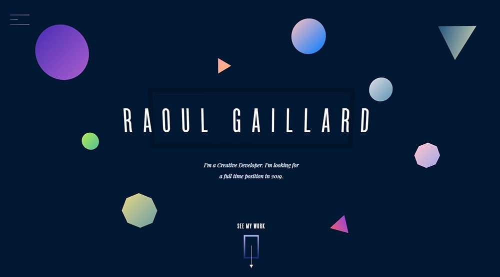
This effect promotes a bigger chance of backlinking as its innovative design improves the site desirability. Our own site is going to be a good starting point to generate natural backlinks through the web and by creating shares on social media platforms.
Call to action can be more direct.
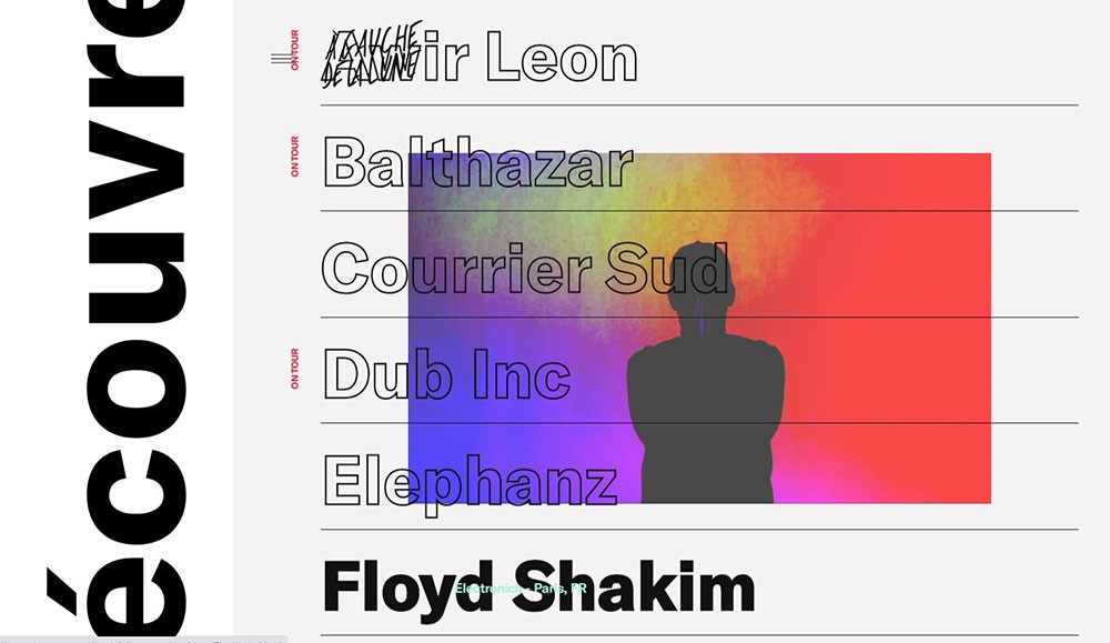
You don’t have to wait until the bottom of a page in order to showcase a compelling call to action. Parallax scrolling can add direct calls to action in different stages. The more a visitor is exposed to join a newsletter or become a member, the more likely they are going to take action.
Tips on creating a Parallax Scrolling Website
- Don’t use it too much; you don’t want to make your site too complicated
- Take advantage of it and build up a story
- Try to make it engaging by using depth layering
- Put in focus calls to action that direct the visitor through the site
- Make sure it works on an older browser
- Understand how it works with SEO, you always need to take this into consideration
- If it’s the first time you are using it, search for in-depth guidance or tutorials, many online resources can help
Conclusion
In conclusion, having a parallax scrolling website sounds like it is a good deal for anybody. If you check the tips that we just analyzed, you will understand what the main reasons for doing this are. Maybe you are building a new website or want to make a change to an existing one. Parallax scrolling can do a good job for you and your business.
Still, while parallax is something that looks great and can generate some buzz, don’t use it on any kind of website. If you’re working on a website for a practical tool, let’s say a scheduling app, or whatever SaaS tool, you can’t embezzle it with parallax.
With that type of website, you need to be on point and deliver to the visitor quickly what he is looking for.

