At this point, you must all have seen the Jaguar latest video, as it went viral on almost every social media platform. The car brand went for something totally different from their usual ads, as you can see in the embedded video above. If success is determined by the virality of a video, this was a huge success. If it’s defined by the positive/negative ratio of the reactions, it was a total failure.
Social media reactions to the Jaguar re-branding
The first to complain were the conservative accounts, who were shocked by the fabulous characters and colors of the video, putting all the blame on the LGBT community right away. On X, Jaguar’s post was met with a lot of irony, to which the community manager replied with tweets that seemed to be copy-pasted.
The second point that brought everybody’s attention, even beyond conservative, is the lack of car in the video. If you check the brand’s replies on social media, it was intentional and the video was more of a marketing stunt promising big changes.
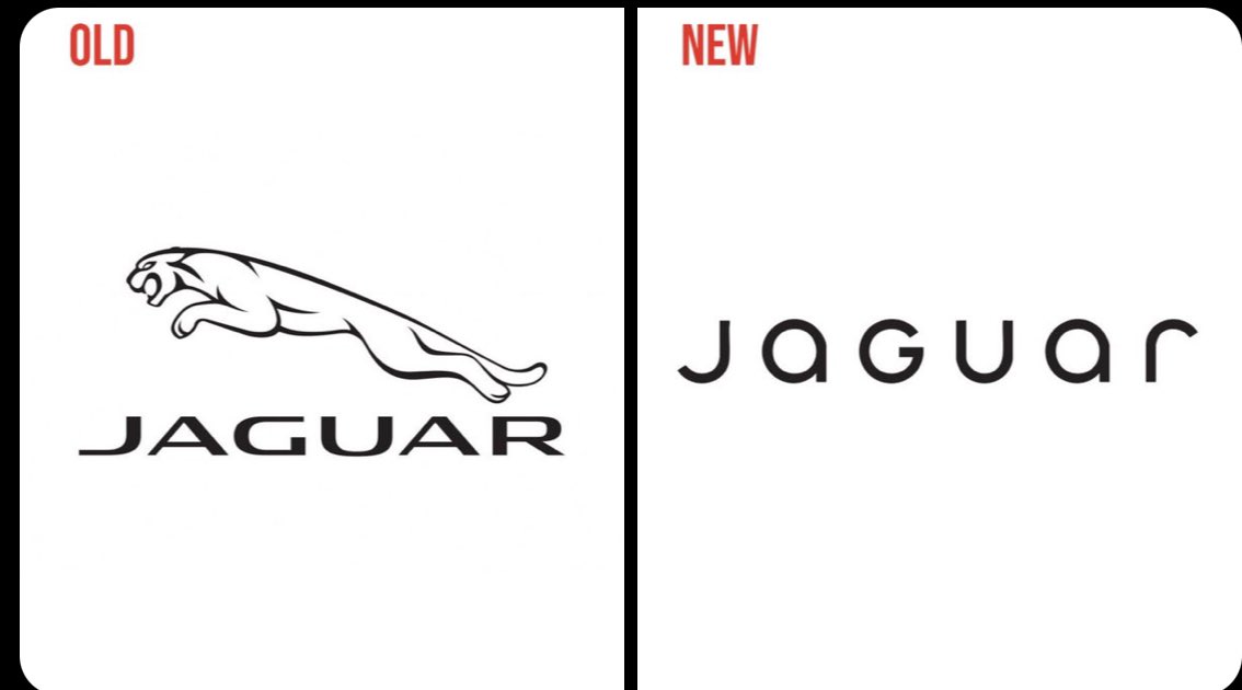
For graphic designers, although the video was the main center of attention, the logo redesign didn’t go unnoticed. Following a global trend, it takes a much more minimalist approach, going as far as removing the jaguar drawing. The typography is less “agressive”, with rounded lower-case letters and much bigger letter-spacing.

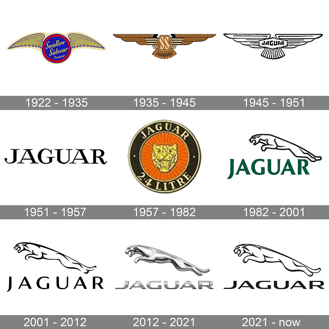
At first sight, removing the stylized jaguar drawing from the logo is surprising, but we could have only seen a part of it, as the drawing might be reserved for other uses. After all, the former logo was also occasionally used without the jaguar drawing in the past. On top of that, this isn’t the first time Jaguar underwent a radical redesign. In fact, it happened several times, as you can see it in the image below. As a sidenote, it’s worth taking a look at the 1935-1945 logo, which was surprising for a British brand considering the politics of the time.

So, what’s the problem with the new branding?
The first issue is that the re-design was totally off-brand. In itself, this is only a problem if the off-brand re-design is unpopular with its targetted audience. In this case, the usual target audience reacted very negatively.
The other major issue comes from the root causes of the re-branding. Although inclusivity is a noble cause, it should not take over the main product in the company’s ads. The radical change in style is also very politically connoted, which is always dangerous when doing business. In the video below, which dates from a few months ago, you can see Jaguar’s head of branding explaining his intentions.
He clearly explains that a radical change is coming, but the change we have been seeing doesn’t have anything to do, but everything to do with the agenda of the head of branding. This type of behavior, not caring about customers, but caring about your own opinions only, reveals a level of narcissism that isn’t very good for the brand.
So, will there be a massive backlash about this ad? It seems so when seeing the first reactions, but we’ll see that in the longer term.

