Wireframes have been an accepted part of the design process for a long time now. Why are they such an integral part of modern design life? For any designers out there unfamiliar or unconvinced by the usefulness of the wireframe then the following look at wire framing and its philosophy should help clear things up.
Why do we have wireframes?
The wireframe serves three main purposes. Firstly it saves time and money by allowing clients to participate in the design process at a stage where it is cheap and quick to make changes. Secondly it’s a design aid, akin to story-boarding in movie making, that gives the designer an overview of the website. Thirdly a wireframe also plays a role on the accountability side of the business.
Designers can get client signoff on wireframes, cost estimates and quotes can be drawn up based on them and they form the basis of the functional specifications. They effectively become the placeholder of all the elements that will be going into the website, and as such are an essential reference for designers, clients and developers alike. So the humble wireframe helps reduce uncertainty and disputes in both the design and delivery phases.
So what actually is a wireframe?

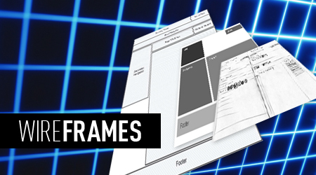
A wireframe is a symbolic representation of a website. As such you need to be familiar with wireframes to be able get the benefit of being able to perceive the overview they present. It’s great if your client is familiar with wireframes, as then they are able to assess more accurately whether the design represents what they need. It also helps if you have a client that knows what they need, but that is another story. Although the representation is symbolic, it is still essentially to scale, so the designer is able to perceive the layout and proportionality of the design.
The wireframe depicts the layout of the website with behavior, functionality and content type. The functional elements are marked in, such as input fields, drop downs and buttons. It will have field names listed for cross reference to the database design (if the site is linked to a database). It will contain the navigational links and any interface logic associated with presentation, such as rules for the display of particular content. The wireframe doesn’t include style, color or imagery.
So what’s the best way to use wireframes?
Since wireframes are so essential and are typically used not just in design but for accountability, it is critical to impose some form of document control on them. The document should have revision control and kept up-to-date with any hand annotations that might occur on printed versions.
Wireframes allow designers to add initiative to elements. For example if the wireframe calls for a rotator then the designer has the liberty to throw out the boring old one and think outside the box, can this rotator be designed in a way that suits the client and target market, can things be a bit out of the box? The separation of function and design gives the designer more freedom to design!
Wireframe gives structure and helps the designer visualize the areas where things go making it easier for creative mind to see where things fit. Wireframes are not there to act as color in boxes or paint by numbers, but to give the designer a perspective on how things flow and allow them to think about things to further help usability and flow of the site
A wireframe is intentionally bare-bones. It should not contain actual design, such as imagery or colors. It does not define the exact layout either. This is to avoid entering into detailed design discussions with the client at a time when the overall flow and functionality is being nailed down. In fact first revisions can be as minimalistic as possible, and then fleshed out once the basic flow has been worked out.
One problem with setting everything out in a wireframe and getting client approval is that often things are going to need to change. This is especially the case were you have external dependencies. If you need to submit user information to a third party then knowing in advance what’s going to be needed is difficult. It’s good to set your clients expectations here, and note it on the wireframe.
What tools are available to help wireframe?

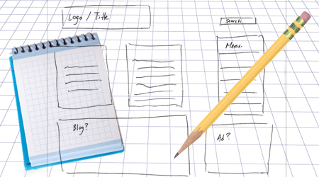
I think most designers will say that your first wireframe should be done with pen and paper. However once the first draft is nailed down it should be transcribed into the computer and kept up-to-date from then on.
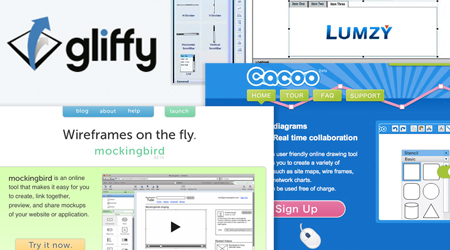
There are several wire framing tools out there. You can fall back on an old faithful like Visio or OmniGraffle, however there are some specific tools that can be very useful. For example iMockups is a cheap wire framing tool for the iPad. This allows you to develop and maintain versions of wireframes with the client or perhaps on a plane or train and then also back in the office. There are online tools as well, such as Cacoo, as well as a plethora of excellent free tools too such as Pencil. Also look at Mockingbird, Lumzy, Gliffy… I could go on.
So where to from here….
For most experienced designers there is no issue about whether a wireframe is a good or a bad thing. The benefits easily outweigh the effort of creating and maintaining the wireframes. Sure there are one or two special cases where it’s better to just jump right in to photoshop and start bashing out a design from scratch, but in the vast majority of cases this approach ends in the expenditure of about twice the effort and time than would be otherwise needed.

